The Analysis of a Lucky Cigarette Advertisement.
Progymnasmata: Fable
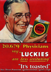
Audience
This advertisement is targeting people who are debating quitting smoking. It highlights the new aspects of Lucky cigarettes that will mitigate the reasons to quit. It’s long words, the older physician and the product shows that the advertisement is targeting an older generation.
Context
If you have ever seen Mad Men you may recognize this slogan and the background of the advertisement. Cigarette brands started losing sales when research groups published journals proving cigarettes harmful effects. Advertising companies started to combat media and scientists. One way they worked around the evidence against cigarettes is by showing a smiling physician holding a pack of lucky’s and a slogan that infers there are less harmful effects, coughing and irritation. They also reinforce the advertisements company own research saying that 20 thousands physicians say luckies are less irritating.
Purpose
The purpose of this photo which is an advertisement is to sell Lucky Cigarettes.
Tone
The advertisement is displaying a calm but exciting tone. It gives off the impression that there is new news. The smiling healthy physician gives a comforting tone and holds a neat inviting pack of cigarettes. Nowadays it has a vintage look but back in its day it would have fit in with other advertisements nicely.
Arrangement
Location
The photo is split in half the top half showing the jolly faced physician and the bottom half shows the slogan. The arrangement is nice and forces the eye to go to the slogan first, then with the surrounding information complimenting the information and tying the image up nicely.
Scale
The scale works, the consistent red color ties the top half with the bottom half. I do wish the words were a different size so they fit together nicely. The words seem a little misplaced, and childish.
Font
The font changes quite a bit in this advertisement, which makes it look haphazard. There are lots of smaller symbols like quotation marks, which while necessary are distracting when displayed like such. The change in color while trying to highlight the important words, in my opinion is also quite distracting. I like the advertisement but the words and font are not my favorite.
Connotation
The red that is presented in several places on the image ties everything together. The red is also a very exciting color. It infers blood pumping, warmth or power. The rosy cheeks of the physician is also a signal of warmth along with his comforting grip. The subliminal messages are all leading towards an exciting but comforting new release.
Readability
This image is very readable. It has a point and all the different aspects are trying to prove that point. Besides some small distractions this advertisement is clear, concise, and effective.