Why Data Visualizations About War Matter
We are living now in a particularly important period of relative peace and stability in the world: what has been very contentiously called “the long peace.” More people are alive now than ever before, and a substantial majority of them have never fought in a war, much less experienced one.
This is the reason that data visualizations about war matter.
When executed to their full potential, data visualizations provide an experience that is immediate, informative, visceral, and, depending on the subject, deeply moving.
Great data visualizations immerse users in factual visual narratives that have tremendous staying power- far longer and more detailed than that any book, article, or even film. This is because data visualizations are integrated content, something that humans instinctively respond to. Statistics and factual evidence are translated into visual, intuitively-consumable structures of meaning, and this is done with the kind of symbols, design principles and strategic imagery that grabs the attention long enough for intellectual and deeper emotional engagement to take hold.
Data visualizations are effective at teaching users about almost anything, from accuracy in “true story” movies to song bird migration patterns to why infographics (a form of data visualization) are effective. They can also teach a distaste for war to people who have never fought in or experienced one, even when they are surrounded by romanticized historical violence and increasingly fervid nationalism. They have been deployed to combat this at various points in history because this is not a unique combination by any means.
Hearing about the cost of war in high school history classes does little to make the consequences of war real, and many people lose track of their history once they move into careers and adult life anyways. But every period of peace can be enriched and hopefully sustained by understanding the wars and lives lost that bracketed it, and often made it possible in the first place.
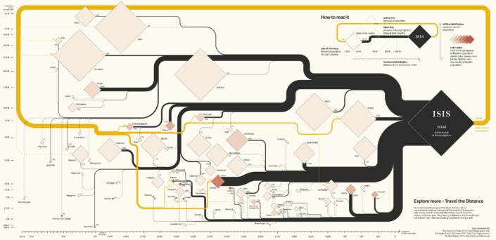
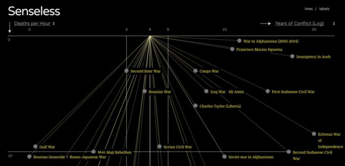
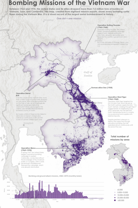
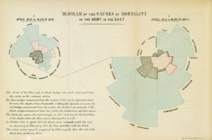
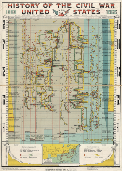
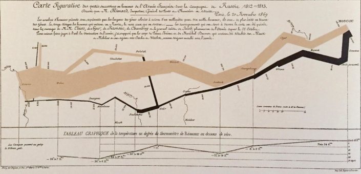
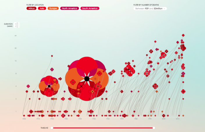
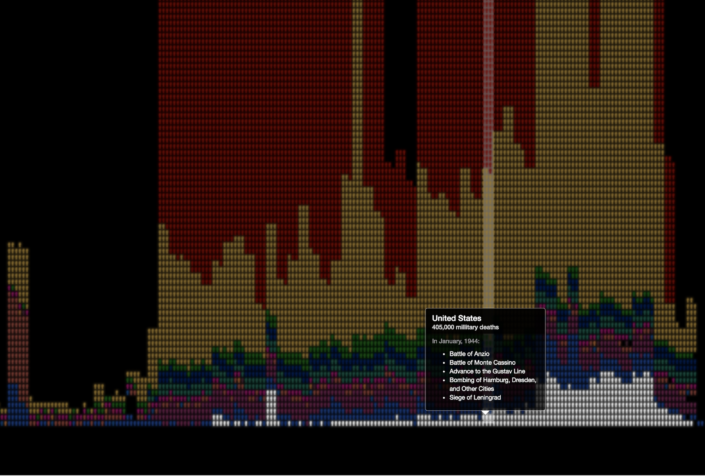
The engaging immediacy of data visualizations can fulfill this function, and these innovative, beautiful works of artistic analysis (or analytic art) have been doing so for centuries. This website has compiled five of the best examples of war visualizations, from Florence Nightingale’s 1858 ‘Diagram of the Causes of Mortality in the Army in the East’ which also saved the lives of countless soldiers, to Neil Halloran’s highly acclaimed interactive video ‘The Fallen of World War II.’
The information design scholar Edward Tufte characterizes excellence in data visualizations as consisting of “complex ideas communicated with clarity, precision, and efficiency.” Efficacy and economy are paramount: the most powerful data visualizations “gives to the viewer the greatest number of ideas in the shortest time with the least ink in the smallest space.”
War is a reality for millions of people alive today, as it has been throughout human history, with terrible consequences. But to the majority of the world, war is a complex, multifaceted idea, formed from stories and classes, movies and music, family scars, news stories, video games, and epic literature. Art which accurately shows those intimate consequences while cohesively and comprehensively imparting the bigger picture of war in the world is so important. In helping people to truly understand all that the idea of war entails, these data visualizations can motivate people to stop that idea from becoming any more of a reality than it already is.

