2014 War in Afghanistan – Bohannon/Brower
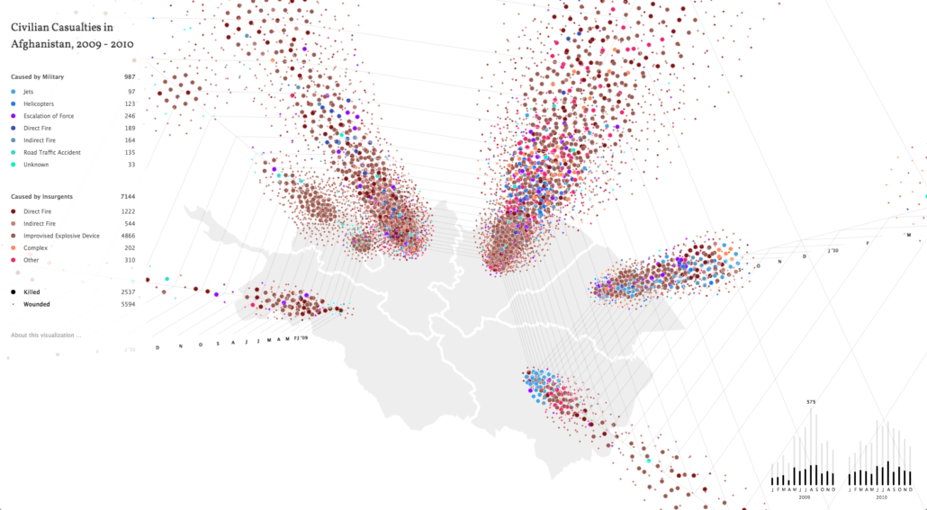
This piece from 2010 details the civilian casualties from the War in Afghanistan through an interactive plume graph produced for Science Magazine. A static version of this data visualization was also the cover for that month’s issue. This is a collaboration between a scientist and a data researcher, Bohannon and Brower respectively, whose spare final product speaks eloquently about the loss of life that has reached such heights. Users can customize the data they see, and move the data in 3D space. The map of Afghanistan that serves as the base grounds the piece and also contextualizes the losses by location.
http://www.sciencemag.org/site/feature/data/hottopics/afghanistan/visualization/index.html