
Lessons from ‘Losses from the Russian Campaign’
by Sarah Grace
The piece called “the best statistical graphic ever drawn” by seminal data visualization theorist Edward Tufte is Joseph Charles Minard’s ‘Carte figurative des pertes successives en hommes de l’Armée Française dans la campagne de Russie 1812-1813.’ Hereafter this work will be referred to as ‘Losses from the Russian Campaign,’ or by its common nickname, the Napoleon infographic. This was one of Minard’s last works, made at age 88, the year before he died. While he received a substantial amount of acclaim in his lifetime, the status the Napoleon infographic has come to reach is phenomenal. This piece launched the field of data visualization, popularized a new method of demonstrating data, and has remained prominent, admired, written about, and regularly imitated almost continuously since Minard made it in 1869.
A 1997 academic paper is dedicated to revisioning it with “cutting edge” 1997 computer analysis techniques, and every new generation of technology has done the same. Twenty years later, a 2017 interactive from a Russian news agency called ‘When Napoleon Went East’ did much the same thing, though on a different scale. It unpacks the story behind the infographic and the data Minard used. This unfolds across an interactive map of the campaign with asides, highlights, visual and explicit references to Minard, and customization options. This data visualization about a famous data visualization won gold in the 2017 Information is Beautiful Awards, an extremely competitive prize. There are also animated versions of the map, and countless other tweaked or overhauled incarnations. The York University site the 1997 paper is hosted on offered a “Re-visioning Minard Contest” with twenty wildly different entries. It has also been reimagined by the popular webcomic, XKCD.

This is the infographic that gets people excited and thinking about data visualization. Some never stop. As his epithet for ‘Losses from the Russian Campaign’ makes obvious, Edward Tufte has put this piece up on a pedestal, to the extent that everyone who attends one of his lectures receives a copy of the Napoleon infographic draped over the back of their chairs. He is not alone in his admiration; even with the explosion of data visualization in the last decade, this one from 1869 consistently takes one of top spots in lists of the best or most influential infographics, especially in lists made by data artists.
If there was a Statue of David or Mona Lisa in the field of data visualization, ‘Losses from the Russian Campaign’ would be it: an over-referenced, often-imitated piece by a master about whom countless books, research papers and website interest pieces have been written. However, like the Statue of David and the Mona Lisa, ‘Losses from the Russian Campaign’ really is a beautiful, effective and affecting masterpiece that actually deserves its hyperbolic admiration.
Even within Minard’s own body of work, this piece is special. The Napoleon infographic was among Minard’s last, but it was paired and printed with a similarly conceptualized work depicting Hannibal’s disastrous march from Spain to Italy. For over a century, the Hannibal infographic has almost always been ignored or treated as a separate piece, even though, according to a 1997 paper by Michael Friendly of York University, “it is certain that Minard meant for them to be compared” and they do exhibit many similarities. Both show the destructive results of storied, ego-driven commanders leading massive forces out of their element, though on different scales. The comparison across time is interesting but both pieces are self sufficient and meaningful without it. The most likely reason that the Hannibal infographic is largely ignored though is the same reason the Napoleon infographic is so celebrated. Both use largely the same brilliant techniques, and the narratives are similar, but the material for the Napoleon one is far more recent, so much richer, and exponentially more horrific.
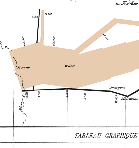
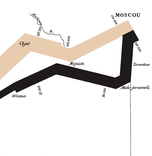
The data narrative told through the infographic is that of Napoleon’s Russian Campaign, when his Grande Armée crossed the Neman (Niemen) River with over 400,000 men from across the French Imperial Empire, in what has been called the largest European force ever assembled up to that point. It crossed into what was then Russia on June 24th, 1812. Just under six months later, the Grande Armée returned over that same river on December 14th with just 10,000 men… a 97% loss of life.
‘Losses from the Russian Campaign’ dissects this catastrophe through the depiction of six variables in an imaginative, integrated, and deceptively simple fashion. There is no flashy title, moving parts, complex color scheme, or moving description that one might expect from a modern infographic. Minard lets the data speak. According to his translated obituary, “Mr. Minard wrote without pretension, thinking only to join concision and clarity.” Minard simply explains how the piece works, and leaves the user to history’s lessons.
The variables Minard uses to tell the story of the Russia campaign include the size of the Grande Armée, represented by “the width of the colored zones” as he says in the translated description. Here he also explains that he intended the colored zones to represent “the men who entered Russia” (the pinkish color, which was once red) and “those who got out of it” (black). However, these colors also inherently denote the direction of the army’s movement. The other represented variables include the Grande Armée’s longitude (x axis); latitude (y axis); the temperature on the retreat from Moscow (in Minard’s contemporary Réaumur scale), and time, as shown through key dates in the retreat. He also gives a window into Napoleon’s strategy by showing the branching off of battalions to strategic locations along the advance. Here is a version of the Napoleon infographic which includes a Réaumur to Fahrenheit conversion for context.

‘Losses from the Russian Campaign’ is immediately visually rich, but it is also so unique that reading it takes a little getting used to. For one, the map is not obviously Russia. Friendly (1997) writes that “Minard almost invariably chose accuracy of the representation of data over the “tyranny of precise geographical position” whenever conflict arose – It is for this reason he carefully labeled his maps cartes figuratives et approximatives.” Without the distraction of detailed geography, the data is more clear, and the map becomes more intuitive the more you look at it.
It takes the user from the far left of the page and the crossing of the Nieman River all the way to Moscow, and back again. The width and lighter color of the advance have greater visual hierarchy and grab the eye. The line leads through its brutal, jagged diminution to the far edge of the map, where it doubles with the stark black line of the number of men on the retreat. This leads the user back across the page, until the line stops at the river it started at. The map equates life with width, and having followed the course of this journey from its beginning, then wide enough to correspond with 422,000 lives, the thinness at the very end is genuinely terrible.
All of Minard’s brilliant choices were also practical ones. Choosing to change the color of the line to show the retreat was a good move to differentiate it from the advance, but the genius was in picking black. In contrast with the alive-feeling color of the advance, the journey on the way back feels, simply put, doomed. It intuitively expresses the failure of the enterprise, and how the return was an entirely different experience for the forces than the advance. There had been no glory for the Grande Armée, and the spare sobriety of the Napoleon infographic’s palette makes that abundantly clear. The change to black ultimately makes it easy for the user to imagine the experiences that narrowed that line, and turns a military retreat into a horror story that is as emotionally affecting as it is intellectually compelling. This simple, evocative choice is one of the most foundational to the infographic’s success.
Another important choice was that Minard included the rivers, drawn with relative, undistracting accuracy. Again, the map does not look like Russia, but the rivers ground the map in recognizable geography. They also serve two other purposes. The first is that with its bends, forks, varying widths, and turns, the line showing the advance and retreat in ‘Losses from the Russian Campaign’ visually references the rivers it crosses. The shape feels recognizable, almost organic; as a flow map, this is not a far reach. Minard operates on many levels, and a more conceptual metaphor works as well. Lives were carried along this course, directed by the decisions of Napoleon and a scattering of his officers: an unstoppable, inescapable, and deadly current.
Rivers were also of particular significance in the campaign. The Nieman was the start button of the whole affair, and bookended the entire, horrible reality of it. Every river narrows the line of how many lives remained on the campaign, from the Mohilow to the Moskva, just before Moscow. However, as Minard shows cleanly but poignantly, one river exacted a particularly harsh toll: the Bérézina.
An article from The Economist which covered Minard reports that “the French now use the expression “C’est la Bérézina” to describe a total disaster.” As the map shows, over halfway through the retreat, the 20,000 remaining forces who actually made it to Moscow (and survived the retreat to that point) were reunited with 30,000 men who had branched off early in the campaign to hold a more northern part of Russia. Their death rate was comparatively low (5,000/35,000). Without the journey to Moscow it is likely that their experience was substantially less horrific than their compatriots, but this did not last. The combined forces shortly reached the freezing Bérézina river. Minard shows the sudden, jagged cut to the width of the line; 22,000 men, almost half of the combined forces, never made it across.
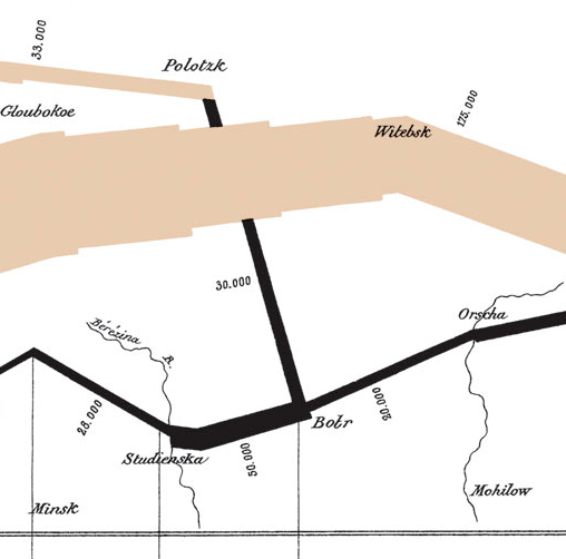
On the map this event is given no notation or description to mark it- just the change in width and numbers on either side of the river. No explanation is required; the user can find the event with ease, immediately understand what it shows, and feel the repercussions. Minard’s representational devices are almost entirely self-sustained. It is worth noting that in English language articles, ‘Losses from the Russian Campaign’ is almost never shown translated or given a translation in the article text. This is because the description, simple as it, is almost superfluous. If the user has heard of Napoleon and knows that the infographic is about the Napoleonic campaign into Russia, the map can do the rest.
E.J. Maray is quoted as saying that the piece “seemed to defy the pen of the historian by its brutal eloquence.” Everything is clear, and nothing obstructs appreciation of the horrors of the data, like the crossing of the Bérézina River. The representation is impartial, clinically beautiful, and does not soften the reality of the events it depicts. This is the “brutal elegance” to which E.J. Maray refers. Minard’s obituary writer explains that his directive with information graphics was “that the first glance takes in and knows without fatigue, and which manifest immediately the natural consequences or the comparisons unforeseen.”
Minard’s retirement, which began in 1851, was spent in the years of France’s Second Empire (1852-1870), a Bonapartist regime. Under this administration, people were encouraged to be nostalgic about the years of France’s ascendancy during the first imperial period and the Napoleonic wars were heavily romanticized. For as public and respected a figure as Minard to make ‘Losses from the Russian Campaign,’ so accurately and horrifically depicting the beginning of Napoleon’s downfall and greatest military catastrophe in his career, much less in the history of the country of France, was a statement as clear as it was bold. The fundamental purpose of ‘Losses from the Russian Campaign’ was to show the cost of war, and to force a revisionist public to remember that cost, and own their loss. At this, he succeeded.
Minard had an abhorrence of warfare. He was never a soldier, but he did experience war. Already a star government engineer working internationally in 1815, he found himself “confined in the besieged town of Anvers” after which he “always retained a sharp impression of some bloody episodes of the bombardment.” He later had the task of overseeing the rebuilding of much of what the wars of the period had destroyed, and this experience stayed with him. Perhaps only in his later years did he have the distance to revisit this period of warfare from 1812-1813, so close to his own experiences two years later. A more likely motivation is that he saw the past being repeated, as the Second Empire descended into warfare; it died the year he did, just after the Napoleon infographic was published.
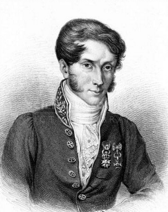
Everything Minard did in his long, incredibly productive life was for a purpose. He is described in his translated obituary by his friend and successor as general inspector of bridges and roads, V. Chevallier, as being “the untiring savant who devoted his long existence to making himself useful.” He always “endeavored to popularize the most salient results” of the great technical, historical and economic questions he studied so that he could share his knowledge. Minard never stopped working and learning, and after his retirement (forced on him in 1851 at 70 by an age limit), “he put out a long series of research as interesting as it was varied, which only death interrupted.” This of course included his data visualizations “to which he attached a well merited importance.” Minard made roughly two of these per year for 27 years. Aside from his information graphics, he wrote “eight short books (including La Statistique, Minard (1869)), 10 sets of course or lecture notes, 30 published brochures and 17 articles” for a prestigious journal. His output was truly prodigious, and with it he made a mark on his world.
Minard first rose in the echelons of French society through his work as France’s chief engineer of roads and bridges, for which he received the cross of the Legion of Honor; he would later be instrumental in the planning of France’s railway system. This influence grew exponentially because of his infographics. The man who wrote Minard’s obituary has reported that “Minard’s influence and contribution was such that, between approximately 1850 and 1860, all Ministers of Public Works in France had their portraits painted with one of Minard’s creations in the background.” In spite of his status and ability to use the resources of the state for his research, his data visualizations were rarely made for the government; he began making them for his lessons when he became the superintendent and professor at the prestigious School of Bridges and Roads.
One of the hallmarks of Minard’s work is his attention to detail and devotion to data. He is always clear on any alterations he has made to the representation of his figures, including the following in the top legend of the translated flow map:
“To better represent the diminution of the army, I’ve pretended that the army corps of Prince Jerôme and of Marshall Davousz which were detached at Minsk and Mobilow and rejoined the main force at Orscha and Witebsk, had always marched together with the army.”
On modern infographics, this would be a footnote, but Minard always strived for transparency, and this choice made the map more effective. On Tufte’s website, he includes a profile of each of Minard’s known data sources, most of which were journals from survivors of the catastrophic campaign. In the translated flow map legend Minard explains: “The data used to draw up this chart were found in the works of Messrs. Thiers, de Ségur, de Fezensac, de Chambray and the unpublished journal of Jacob, pharmacist of the French army since 28 October.”
These sources are not clean-cut reports of troop movements and death counts. In his journal, the pharmacist Jacob, “tells grim tales of finding dead men in the snow, crossing at least a section of the Beresina with his suitcase on his shoulder and his body in the water, eating horses, walking with no hat, no scarf, and no gloves through the blizzard.” Another of Minard’s sources who survived the ordeal, the Duke of Fezensac wrote: “History offers no other example of such a disaster, and this journal can give but a feeble idea of its extent; but at least I have written enough to preserve the memory of the events which I witnessed, some of which are little known.” Because he was an officer close to the top ranks, Fezensac was also aware of the catastrophic decision making going on, so this made him one of the most important data sources. As his profile states, “he was a witness to the ups and devastating downs of the whole affair.”
With intimate, harrowing research materials like these journals, and simply because of the subject matter, ‘Losses from the Russian Campaign’ was not like Minard’s other brilliant graphics, and neither was the process of making it. It is difficult to imagine that a man like Minard would not have applied special effort to representing this subject to the best of his considerable abilities.
However, in the roughly one hundred and fifty years since the infographic was made, the accepted statistics for this conflict have changed, meaning Minard’s numbers of 10,000 out of 422,000 returning from the campaign were incorrect. The number of troops that crossed the Nieman River is now accepted as 600,000, and the number of soldiers that returned is estimated at 30,000- a 95% loss instead of 97%. However, it has been projected that only 1,000 of these men were ever fit to resume military duty.
Because the proportions between the differing numbers are so similar, the magnitude of the loss that Minard portrayed is still accurate, and the infographic has maintained its relevance. The decisions that brought the French army to this devastation also have not changed, and therefore neither has the infographic’s narrative and purpose. It is not very well known, but Napoleon was actually convinced by several of his officers to end the campaign after only a month in, during which time he had already lost over 80,000 men to disease. History might have looked quite different had he not changed his mind two days later. He is quoted as saying, “The very danger pushes us on to Moscow. The die is cast. Victory will justify and save us.” Minard’s ‘Losses from the Russian Campaign’ quietly eviscerates this mentality and the catastrophic death it caused.
It is impressive that Minard’s figures (or at least proportions) were as close to accurate as they were. As seen in the date on the piece, Minard made this flow map in 1869, 56 years after the 1813 return of the remaining soldiers. This was a historical work, even then. Finding accurate data from the survivors was a long and difficult process, and even now it is hard to know how he tracked down the journals and data sources he did, some of which were unpublished. His dedication to pursuing research was as prodigious and prolific as everything else he did.
‘Losses from the Russian Campaign’ came from a brilliant mind that still casts a long shadow. In the last year of his life, Joseph Charles Minard produced a brutally eloquent message about the wastefulness of war that has informed and connected with audiences for centuries. Minard’s last work was also his greatest, and truly deserves Tufte’s epithet of being the best statistical graphic ever drawn.
SUBSTANTIVE REFERENCES:
“I.4 Napoleon’s March to Moscow.” Places & Spaces: Mapping Science. Accessed May 05, 2018. http://scimaps.org/mapdetail/napoleons_march_to_m_9.
Chevallier, V. “A Translation of Minard’s Obituary [“Notice Nécrologique Sur M. Minard, Inspecteur Général Des Ponts Et Chaussées, En Retraite,” Annales Des Ponts Et Chaussées, 2 (1871), 1-22] by Dawn Finley.” The Work of Edward Tufte and Graphics Press. Accessed May 06, 2018. https://www.edwardtufte.com/tufte/minard-obit.
Friendly, Michael. Re-Visions of Minard. York University. York University. October 7, 1997. Accessed May 5, 2018. http://euclid.psych.yorku.ca/datavis/gallery/minard/minard.pdf.
Greenspan, Jesse. “Why Napoleon’s Invasion of Russia Was the Beginning of the End.” History.com. June 22, 2012. Accessed May 05, 2018. https://www.history.com/news/napoleons-disastrous-invasion-of-russia-200-years-ago.
Heiss, Andrew. “Exploring Minard’s 1812 Plot With ggplot2.” Exploring Minard’s 1812 Plot with Ggplot2. August 10, 2017. Accessed May 05, 2018. https://www.andrewheiss.com/blog/2017/08/10/exploring-minards-1812-plot-with-ggplot2/.
Jacobs, Frank. “The Minard Map – “The Best Statistical Graphic Ever Drawn”.” Big Think. December 31, 2007. Accessed May 06, 2018. http://bigthink.com/strange-maps/229-vital-statistics-of-a-deadly-campaign-the-minard-map.
Knight, Joe. “Why Napoleon Lost Against the Russians in 1812, One of the Great Military Upsets.” Slate. December 11, 2012. Accessed May 06, 2018. http://www.slate.com/articles/health_and_science/pandemics/2012/12/napoleon_march_to_russia_in_1812_.
“Is This The Best Infographic Of All Time?” Delucchi Plus. February 04, 2015. Accessed May 05, 2018. http://www.delucchiplus.com/best-infographic-time-marketing-research/.
Mason, Betsy. “The Underappreciated Man Behind the “Best Graphic Ever Produced”.” National Geographic. March 16, 2017. Accessed May 05, 2018. https://news.nationalgeographic.com/2017/03/charles-minard-cartography-infographics-history/.
McGhee, Geoff. “”Steampunk” Infographics Beautifully Combine Past and Present.” National Geographic. July 16, 2015. Accessed May 05, 2018. https://news.nationalgeographic.com/2015/07/20150709-data-points-steampunk/.
“Minard’s Figurative Map of Hannibal’s War.” The Work of Edward Tufte and Graphics Press. Accessed May 05, 2018. https://www.edwardtufte.com/tufte/minard-hannibal.
Tufte, Edward. “Poster: Napoleon’s March.” The Work of Edward Tufte and Graphics Press. Accessed May 06, 2018. https://www.edwardtufte.com/tufte/posters.
Tufte, Virginia, and Dawn Finley. “Minard’s Sources.” The Work of Edward Tufte and Graphics Press. August 7, 2002. Accessed May 05, 2018. https://www.edwardtufte.com/tufte/minard.
“Worth a Thousand Words.” The Economist. December 19, 2007. Accessed May 05, 2018. https://www.economist.com/node/10278643.