April 27, 2021
Print Ad Deconstruction
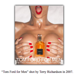
I have chosen this advertisement by Tom ford because it is controversial and thought it would be interesting to deconstruct for class. Lines are used to define shapes and create the concept of volume on the body. The simplistic yet trendy use of colors such as red, white, orange draws the audience to the visual overall composition. The color red symbolizes power, wealth; a certain type of audience. On women, the red intensity of the lipstick illustrates the concepts of lust, love, and beauty; purposely attracting men, the ads target market. Through the use of color, we can see that this advertisement is luxurious and the brand itself represents a sense of class. In terms of composition and unity, this piece is very symmetrical and visually direct. The warm tones are balanced on both sides of the frame, as a result, it creates a visual that is appealing to the eye. The composition also has a sense of variety, the use of elements such as hands, body, and sheets allow the concept/purpose to show.
The use of a light shadow behind the body allows us to see an aspect of 2d/3d space, creating an illusion of depth in the advertisement. Another interesting component was the use of oil on the body, as the light hits the woman’s body, aspects of her figure are highlighted, creating a very sweaty picture. This again contributes to the concept of the advertisement.
The typeface used was sans serif, which is commonly used in headings and print media. This advertisement is not meant for a digital platform as the font they have used causes problems related to display. It’s very clean and modern. The use of hierarchy is visible in the text, as the title of the advertisement is towards the end of the frame not at the start, we can infer this decision was made to emphasize the context/purpose of the advertisement.
The purpose of this advertisement is very clear and intentional. The advertisement is targeting wealthy men to buy tom ford’s new cologne. This ad schemes to bring men’s eyes to the perfume, it presented very obviously through its position on the female body. The perspective at which the photo is taken personalizes the ad for the male audiences. This ad could be seen as controversial because it can be looked at as sexualizing women. The audience is persuaded to buy the cologne as the ideology behind this ad is focused on the concept that “Women would sleep with you if you bought the cologne.” Another interesting element that I noticed about the advertisement was the position of the perfume, the perfume itself symbolizes male genitalia, it is a phallic symbol.
Overall I think the advertisement sexualizes women and is not a good way to promote a brand.
References/Acknowledgements
URL: https://indie-mag.com/2019/09/tom-ford-problematic-90s-ads/
URL: https://rachelmdavidson.wordpress.com/2013/01/24/tomford/
Reading: Williams, Robin. Non-Designer’s Design Book, 4th ed., Peachpit Press, 2015.
Reading: Scott McCloud, Understanding Comics: The Invisible Art, ch. 5: “Living in Line”
Reading: Mary Stewart, “Principles of Two-Dimensional Design: Composition, Space & Motion”