Author: es5927a

Scene Deconstruction

The clip is from Zack Snyder’s Justice League, a remake of the 2017 movie Justice League. “The Flash Creates The Flash Point & Reverses Time” is a climactic scene that shows us Barry (the flash) going faster than the speed of light to reverse time. While the scene is mostly in slow motion, it ultimately builds upon the editing techniques/sequence, audio/dialogue, lighting, and color to the climax of the movie. It will leave you feeling tense and waiting for what is to happen next, building on the model of Freytag’s Pyramid; climax.

I counted around 10 shots, which made the whole composition. I found it interesting to see how the first shot and the last shot were over the shoulder,  it allowed us to build on the climax. Through the closeups and camera angles, we see the direct focus on that character. The closeup shot when we first see the character, is impactful because it shows hows Barry’s face, emphasized the heroic moment of what he is about to achieve/or has to achieve to save the world. The emphasis on the lighting sparks on the helmet and bolts of electricity in the background, create this dynamic shot for the scene, contributing to the overall look of the composition. We see towards the end of the clip, the camera shot becoming closer to Barry’s face, and then all of sudden the scene changes to a more ariel shot. Giving the audience a sense of anticipation for what is to happen next.

The audio and dialogue for this scene are again extremely important as it combines to create the atmospheric tension and anticipation in cinematography. The CGI effect in the background and dark overlay on the shots, created this dark mood for which we see the audio and dialogue, building onto the movie’s highest point of tension. We can hear an echo of his voice, as he saying the dialogue for the scene and his foot thumping the ground as he is running to reverse time. The use of slow-motion in this entire scene is to hold back the climax, to the very last shot when he is reaching the ball of light.

Lighting being a big part of this project, was a prominent element in the scene. We see on multiple occasions how the lighting is used to show movement. It was a way for the editors to show Barry was moving fast, but also another way to bring a contrast to the dark overlay on the shots. It was clever to use the lighting bolts for light to contrast the dark elements of the composition.

In conclusion, the overall composition of the sequence was well throughout. I liked how they built the emphasis on anticipation, however, personally for me the shots of Barry’s face towards the end were a bit too choppy as the transitions were not smooth. There were just shots just cut to his face three different times without any care of the overall transition. The use of clever lighting was interesting to see, it made the scene unique.
Continue Reading

Print Ad Deconstruction

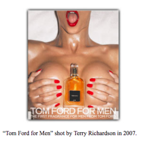
I have chosen this advertisement by Tom ford because it is controversial and thought it would be interesting to deconstruct for class. Lines are used to define shapes and create the concept of volume on the body. The simplistic yet trendy use of colors such as red, white, orange draws the audience to the visual overall composition. The color red symbolizes power, wealth; a certain type of audience. On women, the red intensity of the lipstick illustrates the concepts of lust, love, and beauty; purposely attracting men, the ads target market. Through the use of color, we can see that this advertisement is luxurious and the brand itself represents a sense of class. In terms of composition and unity, this piece is very symmetrical and visually direct. The warm tones are balanced on both sides of the frame, as a result, it creates a visual that is appealing to the eye. The composition also has a sense of variety, the use of elements such as hands, body, and sheets allow the concept/purpose to show. 

The use of a light shadow behind the body allows us to see an aspect of 2d/3d space, creating an illusion of depth in the advertisement. Another interesting component was the use of oil on the body, as the light hits the woman’s body, aspects of her figure are highlighted, creating a very sweaty picture. This again contributes to the concept of the advertisement. 

The typeface used was sans serif, which is commonly used in headings and print media. This advertisement is not meant for a digital platform as the font they have used causes problems related to display. It’s very clean and modern. The use of hierarchy is visible in the text, as the title of the advertisement is towards the end of the frame not at the start, we can infer this decision was made to emphasize the context/purpose of the advertisement. 

The purpose of this advertisement is very clear and intentional. The advertisement is targeting wealthy men to buy tom ford’s new cologne. This ad schemes to bring men’s eyes to the perfume, it presented very obviously through its position on the female body. The perspective at which the photo is taken personalizes the ad for the male audiences. This ad could be seen as controversial because it can be looked at as sexualizing women. The audience is persuaded to buy the cologne as the ideology behind this ad is focused on the concept that “Women would sleep with you if you bought the cologne.” Another interesting element that I noticed about the advertisement was the position of the perfume, the perfume itself symbolizes male genitalia, it is a phallic symbol. 

Overall I think the advertisement sexualizes women and is not a good way to promote a brand. 


References/Acknowledgements

URL: https://indie-mag.com/2019/09/tom-ford-problematic-90s-ads/

URL: https://rachelmdavidson.wordpress.com/2013/01/24/tomford/

Reading: Williams, Robin. Non-Designer’s Design Book, 4th ed., Peachpit Press, 2015. 

Reading: Scott McCloud, Understanding Comics: The Invisible Art, ch. 5: “Living in Line” 

Reading: Mary Stewart, “Principles of Two-Dimensional Design: Composition, Space & Motion” 

Continue Reading

Prize Photo Deconstruction


“Terror of War” by Huynh Cong “Nick” Út in 1972, in Trảng Bàng during the Vietnamese war

The “Terror of War” or also known as the “Napalm Girl” was photographed by Huynh Cong “Nick” Út in 1972, in Trảng Bàng during the Vietnamese war. The Vietnam war was part of the USA’s containment plan in Asia: they wanted to stop the spread of communism in Asia in fear that it would start a chain reaction, it killed more than “3 million people (including over 58,000 Americans)” (History.com editors, 2020) and “half of the dead were Vietnamese civilians” (History.com editors, 2020). The subjects in the photograph are young children from the village of Trảng Bàng and Vietnamese soldiers. We can see children screaming and running away from a bomb that is seen in the backdrop of the photo. Soldiers can be seen in the middle ground, near some of the children. The composition itself felt well established in a sense of chaos, it gives us an insight into the historical context of what is happening. We can infer by this photo that the children are being hurt in the war. 

In the picture, we see a contrast between the children and the soldiers, not only through the darker shades on the subjects but also by their expressions. The soldiers seem to be unfazed by the trauma that is inflicted upon the village, while the children from the village are seen to be in torment and fear. Our focus is immediately drawn to a young female child running from the smoke, naked. The soldiers whose sole purpose is to protect are just escorting these young children down a road, without any actual care of any well-being. Upon investigation, her body had “third-degree burns” (Martin, 2019).

The focal point of this photo is the shouting young naked female child in pain with her arms extended out from her body. This visual represents how a child would scream and cry in pain after getting hurt, and run for their mother. In this picture, however, there is no mother, as the war has taken that away from her. Her childhood and innocence are lost forever because of the war. She, alongside, other children are running right towards the camera, this visual allows us to see how they want help. We can infer that the photo is taken at a higher angle, as the shot is from over the subjects. The angle at which this photo was taken makes children look powerless and innocent. 

The photo is in black and white, which allows us to focus on the subjects rather than on color. This distinction gives powerful meaning to the photo because it allows seeing all the elements rather than the ones which would have only had color. The picture itself is framed through the subjects, by this I mean that subject makes the frame. The composition allows us to see movement. An example of this is seen in the foreground through the boy’s hand. While the picture itself has a clear intent which is to provoke a sense of sadness and guilt. It personally does not seem to be balanced, the left side of the photo has alot more subjects compared to the right.

The photograph’s visual aspects direct us to understand the historical context of what is going on. It clear and intentional by the photographer what he wants to show. He wants to show, pain, fear, innocence, and war. These aspects are visible in the photo. 

References

Freeman, M. (2007). The Photographer’s Eye: Composition and Design for Better Digital Photos (1st ed.). Focal Press. https://www.amazon.com/dp/0240809343?tag=scribbr00-20&linkCode=osi&th=1&psc=1 

History.com Editors. (2020, August 19). Vietnam war. History. https://www.history.com/topics/vietnam-war/vietnam-war-history#:%7E:text=More%20than%203%20million%20people,of%20U.S.%20forces%20in%201973

M. (2020, November 14). Story behind the terror of war: Nick ut’s “napalm girl” (1972). About Photography Blog. https://aboutphotography.blog/blog/the-terror-of-war-nick-uts-napalm-girl-1972

Williams, R. (2015). Non-Designer’s design book (4th ed.). Peachpit Press. https://www.amazon.com/dp/0133966151?tag=scribbr00-20&linkCode=osi&th=1&psc=1 

Continue Reading
Continue Reading
Continue Reading

Final Project Plan/Short List

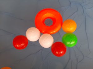
Summary: Selling a magic ball, that grants you anyone wishes you want.

  • Person wishes for dogs and a pool.

Shot 1- Opening scene (Q and A style)- like vogue question videos

Knock on the door, overlay conversation, introduction to the magic ball. Throwball in the air cut. The camera follows the person and then the ball.

Shot 2- Makes the wish

The ball is seen thrown in the air and falls in a pool of water with toys and a person in the pool. Cut scene to another angle.

Shot 3- Confusion

Side angle splash scene, confused face, overlay conversation related to dogs.

Shot 4- Dogs running

Low angle cut of dogs running.

Shot 5- The Meet

Side angle of dogs final meeting the character near the pool. Character throws balls for dogs to play with, out of the pool.

Shot 6- The Throw

Back angle, behind-the-shoulder shot. Dogs chase after toy balls.

Shot 7- Happy Ending shot

Mid shot of torso, eye to eye level. Dog is cut but character is in the middle of the pool. Overlay conversation regarding the ball. Thumps up by character.

Rough draft

  • Added all clips WITHOUT TITLE SLIDE AND END SLIDE.
  • Remove audio from clip. (will add in final)
  • Make rough proper cuts to shots.

Final draft

  • Add title slide and end slide.
  • Add audio and music.
  • Add smoother transitions for cuts.
  • Final edits.
Continue Reading