Designing War-Care: “Diagram of the Causes of Mortality in the Army of the East”
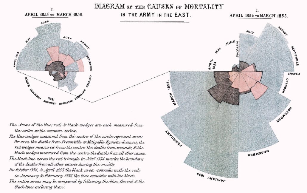
Exceptional data visualizations do have the power to effect widespread change. Florence Nightingale’s legendary 1858 infographic ‘Diagram of the causes of mortality in the Army in the East’ (hereafter referred to as ‘Mortality Diagram’) helped convince Queen Victoria to adapt Nightingale’s recommendations for war medicine and sanitation practices. These would later become standard practice worldwide, and eventually help save the lives of countless soldiers throughout history. Nightingale’s infographic has the distinction of being one of the first data visualizations to shape policy in this way, and with its striking, innovative, and adaptive design, it is not surprising that it is still regarded as one of the most influential infographics of all time.
During the British campaign in Crimea, Nightingale served as “Superintendent of the female nursing establishment in the English General Military Hospitals in Turkey.” During her posting, she saw in cold detail the means by which soldiers were dying in droves. She observed that while the battles took their toll, by far the greatest killer was not the war itself but the de-prioritization of the soldiers fighting it.
A lack of resources allocated for hygienic facilities, proper nutrition, adequate medical care and a host of other factors had led illness (preventable or mitigable zymotic diseases) to skyrocket in hospitals and camps. Hospital conditions were especially appalling because “there were no blankets, beds, furniture, food, or cooking utensils, and there were rats and fleas everywhere.” Unsurprisingly, far more men were dying there, of largely preventable illness, than on the battlefield or from wounds sustained on it.
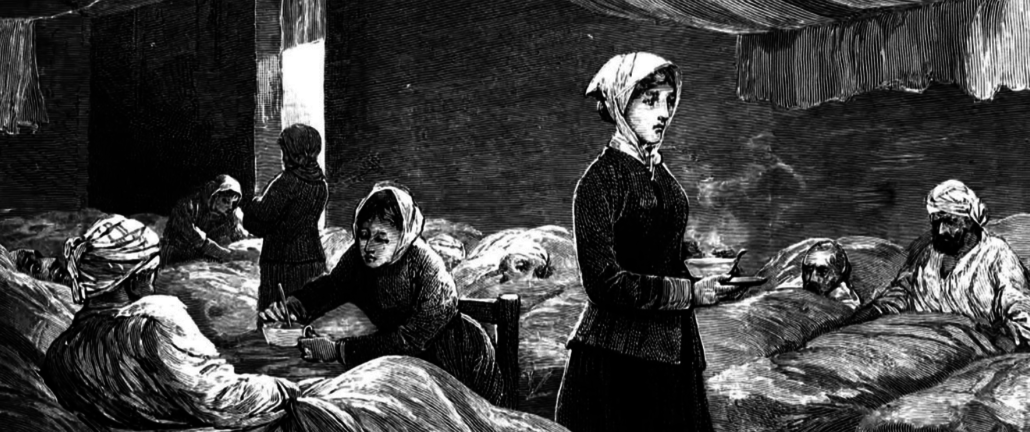
In addition to nursing, Nightingale had also been passionate about statistics and mathematics her entire life, and her family had been wealthy and well-connected enough to foster her aptitude into a skill set that gave her the ability to meaningfully contribute to this field. She believed strongly (indeed, religiously) in affecting change through statistics, and the Crimean War was the first chance she got to put this in practice in the field, though there was essentially no existing data with which she could prove her observations.
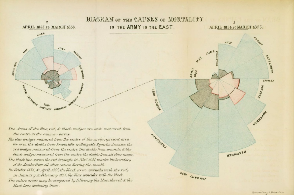
Over her years in Turkey, when she wasn’t working 20 hours a day as a nurse, she meticulously collected the data she needed herself. It is rare for data artists to actually assemble data themselves through primary research, though Joseph Charles Minard was famous for this. Florence Nightingale is almost unique in that she not only did the primary research in person (in this case, inventorying the cause of death of thousands of soldiers for two years), but also wrote so extensively and comprehensively about it. Her first book on the topic, Notes on Matters Affecting Health, Efficiency, and Hospital Administration of the British Army (1858) was 850 pages long and she wrote it in two years. It is in this book that she included ‘Mortality Diagram,’ facing page 311.
Turn the pages in the interactive book below by clicking on them.
Go to a specific page by hovering over the far right section.
Few copies of this book were ever printed, but she sent one of them to Queen Victoria, and when Nightingale returned from Crimea, she was summoned by the Queen and Prince Albert. Partially because of this diagram, Nightingale achieved her goal and “procured their support for a Royal Commission on the health of the army,” which was to later revolutionize and reform war medicine and wider sanitation practices.
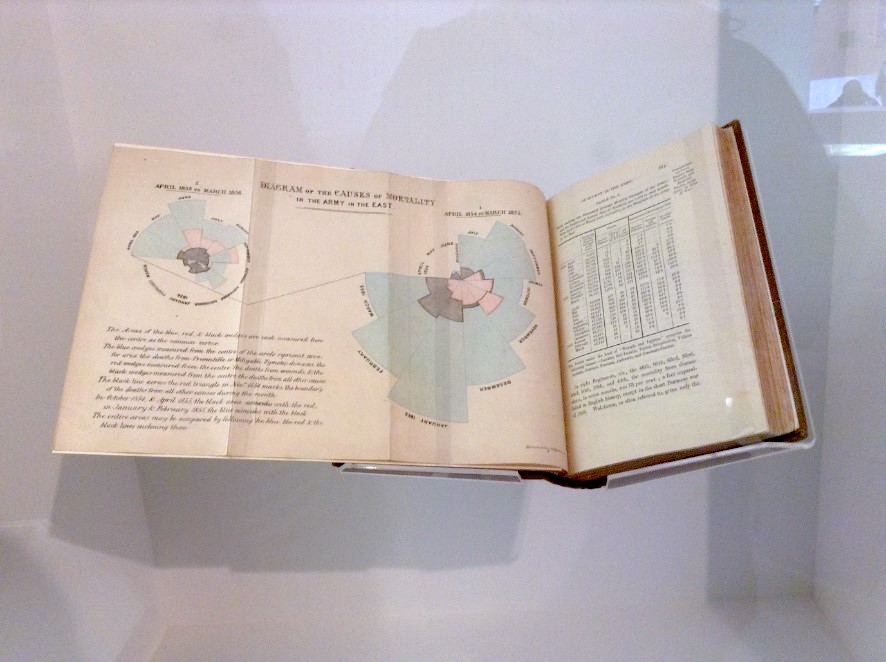
Nightingale also wrote and privately published the illustrated report Mortality of the British Army during this period, which was intended to educate a mass audience. The first sentence of the book reads: “Diagrams are of great utility for illustrating certain questions of vital statistics by conveying ideas on the subject through the eye, which cannot be so readily grasped when constrained in figures. This aid has therefore been called in to give greater clearness to the numerical results.” (p1).
While Nightingale herself found “the sight of a long column of figures “perfectly reviving”,” she clearly recognized that reaching the people who had the pockets and the power to effect change required presenting her data in a way that would make them want to. The method of a message like hers matters, and by creating something that the Queen actually wanted to look at, Nightingale was able to hold her attention and motivate her to act based on her data’s conclusions.
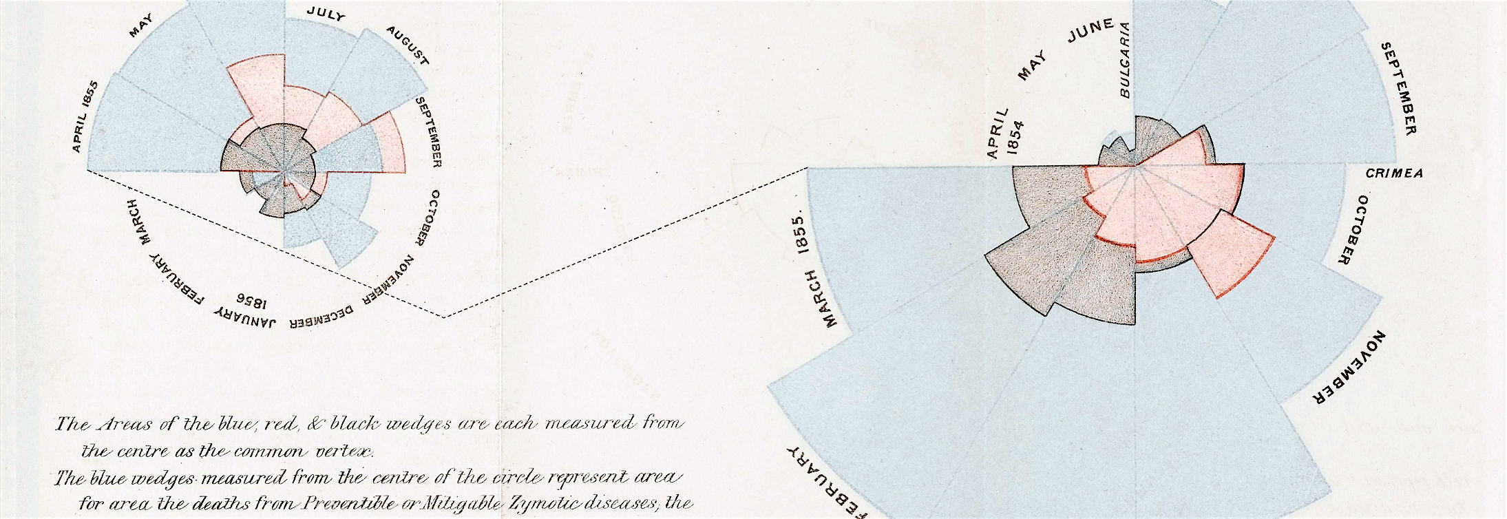
She summarized these conclusions in what has come to be known as a rose diagram, polar area graph or coxcomb diagram- the first of its kind. Nightingale had a knack for “devising graphic methods,” and her innovation and imagination show in this visually complex, data-centric representation. According to Tableau, “Coxcombs help make seasonal patterns visible and deemphasize small differences while providing a nicer image” than many other types of charts. Nightingale created exactly what she needed to fit her data.
There is a lot going on in this chart and its addendum. Time, deaths by illness, deaths from battle, deaths from other factors, and location are represented. Executed clumsily, this infographic could easily have been opaque, illegible, or, worst for Nightingale’s purpose, unmoving. However, with her own good data behind her and meticulous planning and execution, the trend Nightingale observed was clearly and powerfully communicated.
Because of its construction, this infographic allows users to instinctively and directly compare the major causes of casualties of war in a given month and across the course of a campaign. The most obvious way to represent this kind of data now, as it might have been then given that the pie chart had already been around for about fifty years, would be a single pie chart showing the percentages of causes of death for the two year period covered in by the data. This does not get at the harsh realities shown in the month by month view however, and it lacks the kind of attractive intricacy that Nightingale’s diagram has which inspires further study.
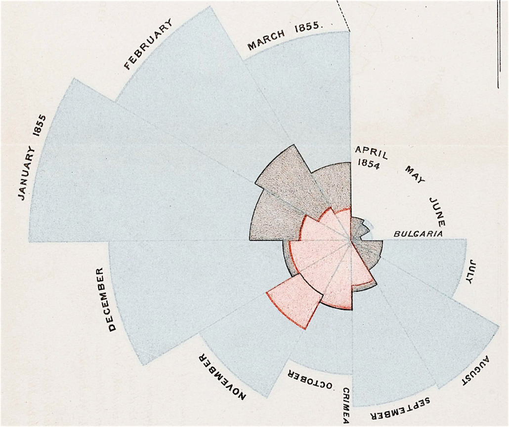
In contrast with a modern pie chart, the pie wedges in this type of chart are cumulative. Each wedge represents the total casualties from a month of war. Each layer within that wedge is measured from the center of the circle to its unique boundary. Thus, [——-[—–] would convey that [————] number of soldiers died from disease while [—–] died from battle-related causes. It is additive, in that each partial, overlapping wedge represents a distinct figure. Color is carefully used to differentiate these boundaries and the almost entirely consistent, distressing ratios between the causes of causes of death they represent.

The colors of the diagram (blue, pink, red, white [and black outlines]) are striking and effective while still being inviting. This is important for such a somber subject as the wasted deaths of thousands of soldiers. Nightingale was British and appealing to a royal government audience, so at a stretch, these colors may be a also subtle nod to the Union Jack.
An interesting note is that Nightingale used four separate fonts in the ‘Mortality Diagram,’ each of which has a consistent purpose which helps the user intuitively navigate the piece. This is standard practice in today’s design world and in modern data visualizations, but it is extremely rare in historical ones. Usually, as in Minard’s Napoleon Infographic, the title uses a particularly intricate and attention-grabbing font, and the body of the infographic, including the description and labels, use a second more conventional one. In Nightingale’s infographic, she made the labels a blockish, linear, easy to read sans serif font which contrasts nicely with the cursive description. She used these fonts to reinforce the visual flow of the infographic, engaging the user with the context and most basic information first before offering an explanation and call to go deeper into the data.
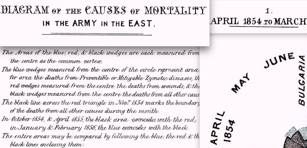
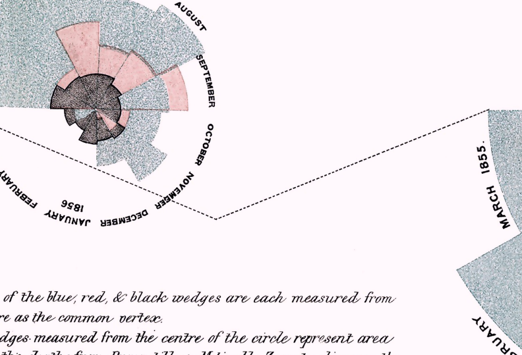
One of the most important choices in the infographic was to not try and cram the entire two year period (from April 1854 to March 1856) into one diagram. It would have given a more comprehensive picture of the total deaths, but 1/24th of a circle is a very thin space in which to fit comparative information, and the nuances in irregular months like those when battles exacted a particularly harsh toll would have been lost. Splitting the months up by year is a natural choice.
Another brilliant design move was one year reaching across the page to connect to the second with a simple, undistracting dotted line. The first year’s representation is substantially larger than the second, so this is where users look first, and the line guides them to the following year and also to the description.
The data under question is not entirely straightforward; some adaptations had to be made, and these are clearly explained. For two to three months, the leading cause of death was not disease, but battles. This stylistic problem was solved without breaking the visual continuity of the other months of warfare. In the description, Nightingale explains that “The black line across the red triangle in Nov. 1854 marks the boundary of the deaths from all other causes during the month. In October 1854, & April 1855, the black area coincides with the red, in January & February 1856, the blue coincides with the black.” This kind of improvisation and problem solving is why this infographic is so highly regarded, and why it became a template for an entirely new form of data visualization, which is still in demand and in use today.
Nightingale is the only data artist covered by The Art of Consequences who is an international household name, but she is not famous for this infographic, or for her work as a statistician. None of the other data artists profiled by TAoC are ever likely to be household names for their work in the area either, which accurately reflects a field whose stars are decidedly behind the curtain rather than than in front of it, regardless of how famous and influential their work may become.
Nightingale’s data visualizations and work in statistics have always inspired people though, and some more than others. Similar to Edward Tufte’s devotion to Minard, academic Hugh Small is a something of a Florence Nightingale scholar and a (truthfully well-earned) superfan. He has written and continually expanded a biography about her, and also happens to have been the network architect for the world’s first commercial internet. Interestingly he argues in his latest revision of her biography that Nightingale was the one to create “the public health legislation of 1875 which historians now agree caused the astonishing increase in national life expectancy over the period 1874-1935.”
Small is not alone in his admiration. In recent years especially, her prowess in statistics has become an extremely popular topic for online interest pieces looking to prove the that great information graphics were not exclusively the provenance of historians, economists, or, more pointedly, men. This is an extremely laudable goal, and one which has the potential to inspire more girls to get into STEM fields.
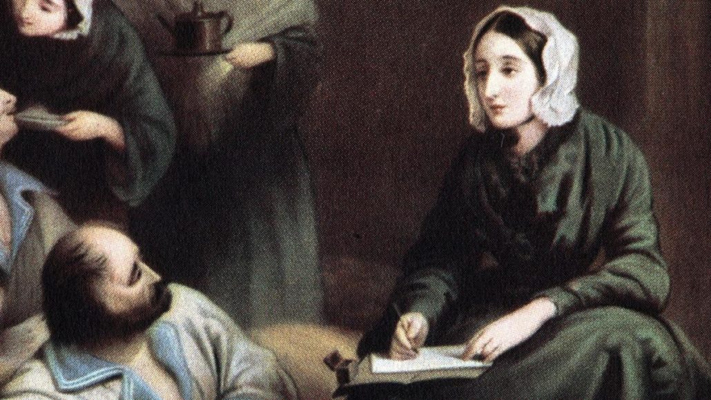
Nightingale is a complicated role model for young women however. While she herself was an empowered woman who changed the world and fought for more employment opportunities for women, she was also quite the misogynist. She is quoted as saying that women “cannot state a fact accurately to another, nor can that other attend to it accurately enough for it to become information” and was against female suffrage and women doctors.
It is an open question as to whether a high-achieving, deeply influential woman who saved the lives of millions- and who is also misogynistic- should really be a positive role model for young women. Whether she should or not, the fact is that she has been, for centuries, and with positive results. The former National Statistician of the UK, Jil Matheson, has said Nightingale inspired her to get into statistics:
Florence is an inspirational figure for many women in particular, the ‘lady with the lamp’ was also a lady with powerful ideas with the commitment and passion to put them into practice. As a consequence, she made a lasting and important impact in the fields of both medicine and statistics.
Matheson was also the UK Head of the Government Statistical Service and Chief Executive of the UK Statistics Authority; clearly, Nightingale’s influence has been a positive one on STEM women in power.
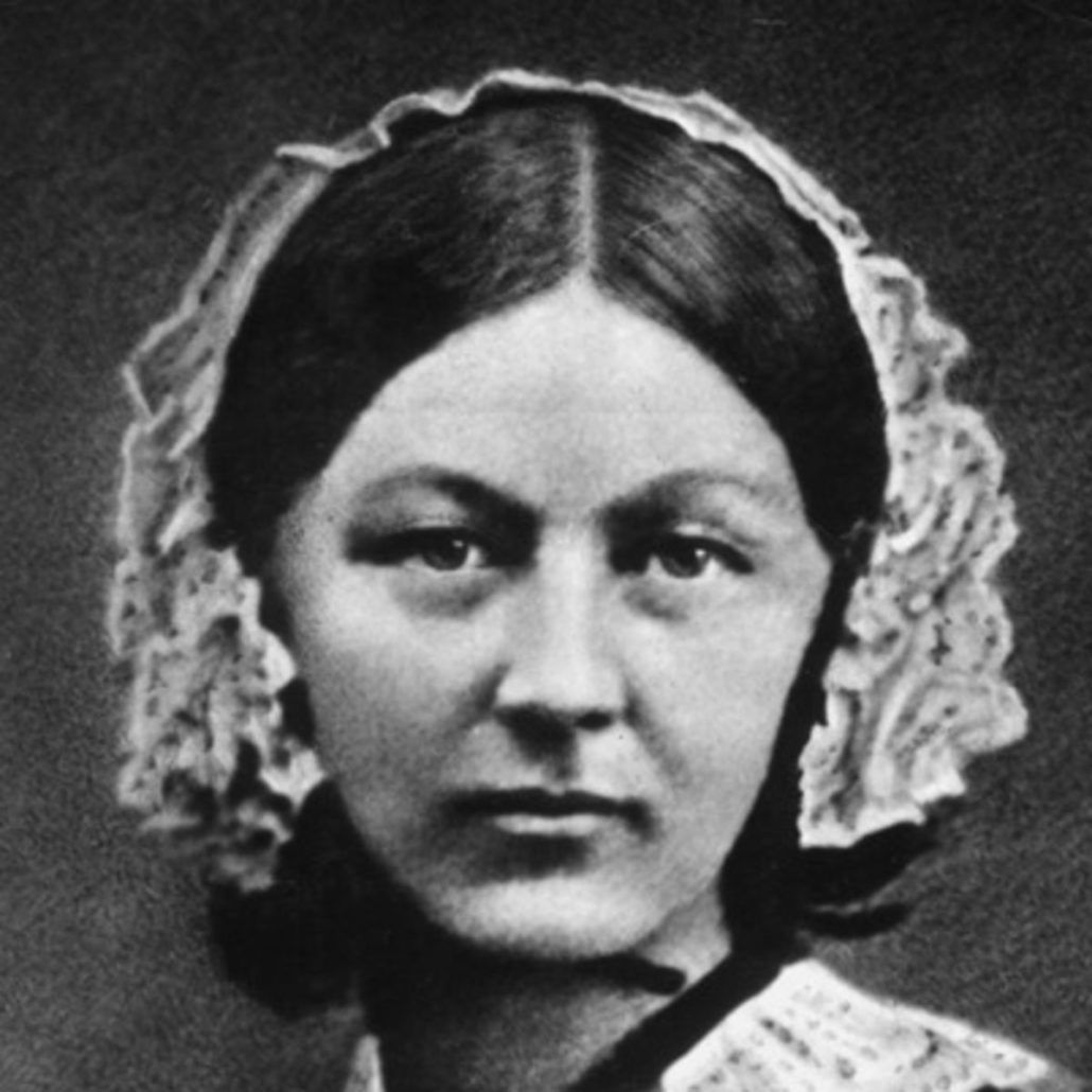
Regardless of her personal beliefs, Nightingale was a powerhouse social reformer and statistician who was capable of running high level national statistical analyses by herself, writing 850 page books in 2 years, and creating beautiful, effective information graphics that inspire to this day. Armed with good data, great design and a greater purpose, Florence Nightingale used her ‘Diagram of the Causes of Mortality in the Army in the East’ to change the standards and practices of warfare and mass sanitation on a massive scale. Given the scope of the wars that would consume the next century, and the prodigious growth of cities in the same period, it is impossible to estimate how many lives she saved through her work and through this infographic.
Hugh Small discusses the contributions of Florence Nightingale.
SUBSTANTIVE REFERENCES:
Beran, Bora. “Creating Coxcomb Charts in Tableau.” Bora Beran On Anything Data. March 31, 2014. Accessed May 06, 2018. https://boraberan.wordpress.com/2014/03/30/creating-coxcomb-charts-in-tableau/.
“Florence Nightingale Biography.” The Biography.com Website. Accessed April 18, 2018. https://www.biography.com/people/florence-nightingale-9423539.
“Jil Matheson.” NATSEN Social Research. Accessed May 07, 2018. http://natcen.ac.uk/about-us/people/trustee/jil-matheson.
Ims25. “Nightingale’s ‘Coxcombs’.” Understanding Uncertainty. November 5, 2008. Accessed April 18, 2018. https://understandinguncertainty.org/coxcombs.
Magnello, Eileen. “Florence Nightingale: The Compassionate Statistician.” Plus Magazine from the Cambridge University Millennium Mathematics Project. December 8, 2010. Accessed May 07, 2018. https://plus.maths.org/content/florence-nightingale-compassionate-statistician.
Oyler, Lauren. “It’s Really Sickening How Much Florence Nightingale Hated Women.” Broadly by Vice. November 20, 2015. Accessed May 07, 2018. https://broadly.vice.com/en_us/article/kb4jd3/its-really-sickening-how-much-florence-nightingale-hated-women.
Rogers, Simon. “Florence Nightingale, Datajournalist: Information Has Always Been Beautiful.” The Guardian. August 13, 2010. Accessed April 18, 2018. https://www.theguardian.com/news/datablog/2010/aug/13/florence-nightingale-graphics.

