
Revisioning Death & Legacy: ‘The Fallen of World War II’
One of the virtues of many of the other visualizations profiled by The Art of Consequences is that they show more than they tell. Illustrations eloquently speak with numbers, and as Edward Tufte, a seminal figure in the field of analytical design would have applauded, only minimal explanation is required or desired to understand the data’s story.
Neil Halloran’s ‘The Fallen of World War II’ decidedly tells as much as it shows. This interactive video features narration throughout its 18 minute runtime, in addition to some on-screen explainer text, labels throughout, and a write-up on the site it’s housed on. Still, the higher volume of spoken and written words, paired with his collaborator Andy Dollerson’s music, do nothing to detract from the power of the haunting visualizations they support.
Halloran’s gifts for contextualizing figures visually and comparative analysis shape ‘The Fallen of World War II.’ He finds new ways to frame the deaths that took place because of the second World War, like comparing losses from all the countries as a percentage of their total populations, and then extending this comparison to the losses exacted by past wars. With this statistical acumen as a foundation, Halloran’s narrative and dramatic flare engage the viewer, working in tandem with the innovative medium, and bolstering his call to understand and care about the past so as to change the future. ‘The Fallen of World War II’ is new media statistical storytelling at its best.
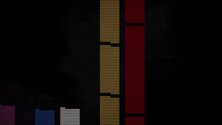
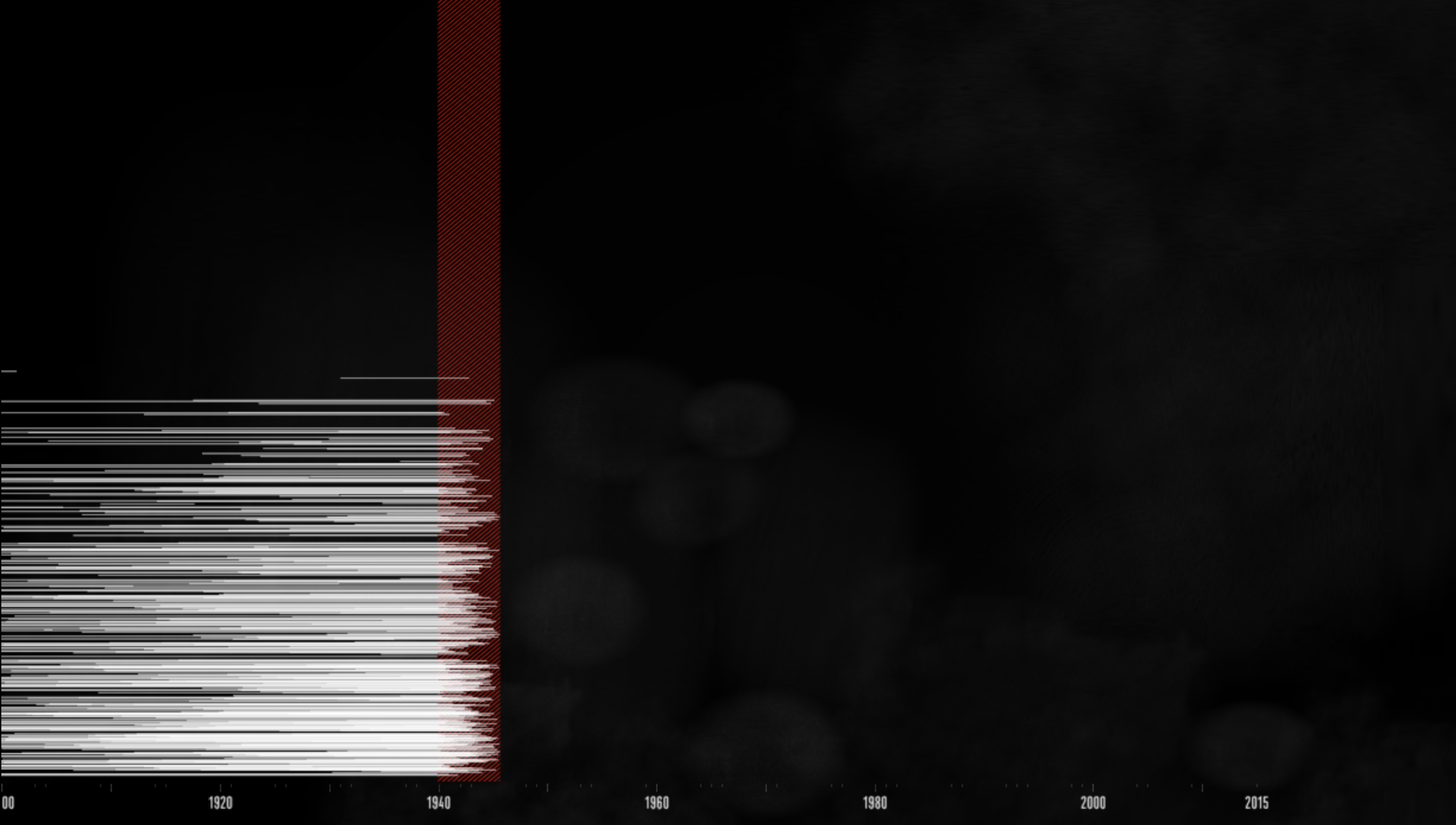
The central currency of ‘The Fallen of World War II’ is a comparatively universal symbol- a stick figure. Closely resembling the symbol used on men’s bathroom signs, it is used either on its own to represent civilians, or modified by the presence of a gun to denote soldiers. These two figures compose the majority of the illustrations and visualizations, and even appear in the site’s favicon (the logo that appears in web browser tabs).
As with many components of this interactive video, it is not the elements themselves that show innovation, but how they are used. Halloran employs each of these ubiquitous figures to represent 1000 lives lost, either civilian or soldier. Throughout the video, as comparative death counts mount higher and higher, and the stacks of human figures grow, the user intermittently remembers that the columns and rows show a thousandth of the cost to life.
![]()
Halloran’s brilliance here is that he makes the user work to keep track of the dead. He engages the imagination early with an illustration (in a more realistic style) of the thousands of people that lone, simplistic figure stands for. The user must substitute this image throughout the video, or find their own way to see the numbers.
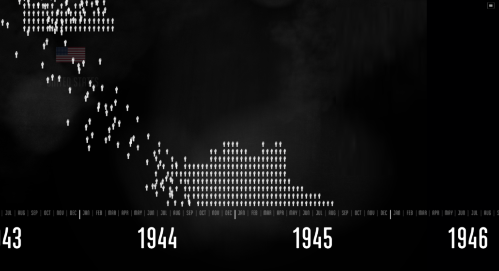
Personally, I remembered a scene from The Matrix. Rows upon rows of shelves unfold onto the screen, and then fly past the camera, exposing the sheer number of weapons contained in a single one. Watching the video, every so often I would imagine that each figure on screen was the first in a row of 1000 people, and try to see that for every figure on screen. During the Russia sequence (approximately 4:49-6:56), attempting this became overwhelming, to the point of absurdity; I was seeing millions for the first time.
1,000,000 is a hard number for people to envision, and a difficult number to see. Few of us ever find ourselves in a situation that requires personally counting that high. There is an adage, sometimes attributed to Stalin (a bitter connection in the context of this video-see 9:45-10:37), that one death is a tragedy but a million deaths is a statistic. Using the 1:1000 device unpacks these indigestible numbers, turning them, unit by unit, into the tragedies they were. And so, paradoxically, it is by reducing the number of the dead that Halloran succeeds in making the user understand the true extent of the real losses.
The choice to represent the numbers this way must have also been partially for practical purposes. Halloran made the entire piece by himself and he is always careful to move the figures individually onto the timeline, with one of the smooth, fast flowing animated movement techniques that sets this video apart. He did this with code, not animation software. He explained in an interview that “Creating a film using code (instead of more traditional video tools) allowed me to closely choreograph the animation based on the underlying data, and obsessively tweak how the animation flowed.” Individually coding millions of iterations of any symbol would have exponentially increased the time it took him to make this piece- as it is, it took him two years, not counting brainstorming and planning. Doing a 1:1 representation would also have been visually challenging and overwhelming within the small frame of an interactive video hosted online, meant to be played on laptops, tablets, or phones.
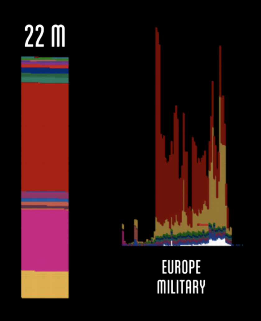
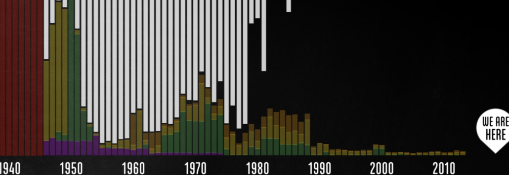
This practical brilliance recurs throughout the piece. When Halloran stacks the fallen populations of the European Theater and other arenas, he does in it bar charts. These have a special weight given their composition, and he goes a step further and often positions them on the timeline that runs through the piece. As Halloran said in an interview: “Bar charts are great for showing relative scale, but they can feel disconnected from what it is they represent. By building the bars out of stacks of figures, each representing 1000 people who died, I tried to make the bars feel bigger and weightier.” This conceptual sense of proportion also manifests through design as the video progresses and the bar graphs get increasingly- tragically- massive.
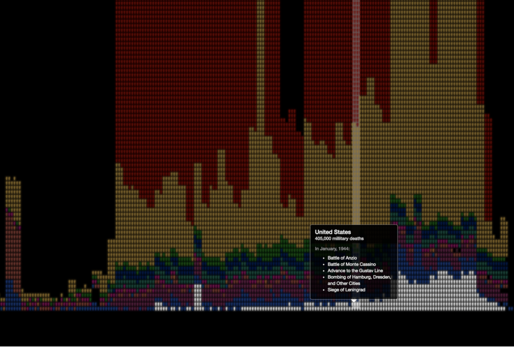
When he finally gives the broad overview of the European Theater that history students are used to (7:12-7:30), he made the brilliant choice to make the segment interactive. Users can mouse over the chart and see hovers detailing each month of battle for any given country’s military. To parse the density of these figures, when hovered over, each different colored country data lights up and gently flashes to hold the user’s attention. With this approach, Halloran has the ability to take the big picture and make it personal, digestible, and new- even after 70 years of history classes.
He has been doing this on a large scale. It is difficult to know how many people have watched ‘The Fallen of World War II’ on his website, but on YouTube the current view count as of May 2nd, 2018 is 3,556,414, and the current Vimeo count is 8.8 million. This piece has gotten a lot of press, including the Vice Creators article and a speaking gig for Halloran at The Times Center. ‘The Fallen of World War II’ has also won multiple awards for visualizations, including the Interactive Innovation Award at The South by Southwest technology festival in Austin, and a gold for motion graphics in the prestigious and competitive Information is Beautiful Awards.
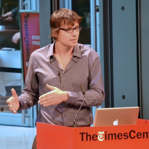
Halloran’s background is in web development. He graduated from the University of Pennsylvania and a 2013 professional profile lists his skill sets as including: “Javascript, jQuery, opengl, AWS, node.js, PHP/MySQL, three.js, HTML5 canvas, CAAT, WebGL”- an impressive array. He built ‘The Fallen of World War II’ with WebGL and Javascript. The same site says he worked as a web developer and CEO at Higher Media, presumably before he got into filmmaking and data visualization.
As shown in a thread on his Twitter, Halloran thinks that data storytelling “can have a revolutionary social impact” and he has argued against analytical artists who try to pull emotion and audience engagement out of data design, or deprioritize them. On his current website, he sums up his work as “cinematic data visualization” and ‘The Fallen of World War II’ shows his ability to engage audiences through great data and pathos.
This project was done in his own time and with financial support only from family, friends, and admirers of the project. He is still accepting a “ticket price” for viewing, and has received enough financial support and acclaim to make a second, similar interactive video called ‘The Shadow Peace’ which addresses nuclear concerns and is definitely worth watching. As he says on the project site, these pieces are intended to be part of a long-running series.
An important question is where Halloran gets his numbers for this particular work. The Vice interview reveals that he used The Upsala Conflict Data Program, hired professional researchers, and used Wikipedia when he needed to: “Obviously you can’t trust Wikipedia content blindly, but the World War II Casualties article provided a great roadmap, offering tons of resources and discussion.” Many different countries have stakes in how big or how small certain losses are in any international conflict, but disputes regarding World War II are particularly fierce. Halloran agrees: “The hardest thing was dealing with contradictory information. I was hoping to stay out of the disputes and just use the most ‘official’ tallies, but it wasn’t so simple.” He went with the most trusted numbers wherever he could.
‘The Fallen of World War II’ illustrates with aesthetic efficacy, not beauty. It is pleasing to the eye and well-composed, with carefully-chosen colors, textures and impeccably executed motion graphics. There are genuinely stunning moments like the final sequence, but by and large the story and the statistics are arresting on their own and Halloran never distracts from them. His strategic minimalism lets viewers engage intellectually and emotionally with the numbers being so brutally and cleanly illustrated for them.
The base colors are greys, white, red, and a constant, at times chalkboard-textured, black background. Black, the total absence of color and hope, and (in Western culture) the color of death and mourning, is an appropriately constant backdrop to an analysis of the largest-scale loss of human life in the history of conflict. In a practical sense, white provides the most effective contrast with this background, ensuring there is no possibility of missing the message. There is also the possibility that Halloran knew white was the color of mourning in many Asian countries, who have as much of a history of loss as the West does in the prodigious scope of this conflict. Finally, red adds dimension and pathos to the stark duality of black and white; appropriately it’s the color of blood, love, and courage.
As the piece shows in its final segment, World War II was a singular event in human history, and that hits close to the message and purpose of this piece. As Halloran says in the video, “more people died in World War II than in any other war in history.” His final figure is 70 million. Neither the wars and catastrophes before, nor the wars and catastrophes after occur on such a global scale, and therefore have such a pressing need to be felt and understood.
Most of the world have been told the weight of these events their entire lives, though the numbers differ in the telling. As ‘The Fallen of World War II’ is translated into other languages, more and more people will have the chance to feel personally responsible for keeping Halloran’s version of these numbers in their minds; to feel them; to interact with them; and to be guided- carefully, freely- into thinking about how this particular war changed war itself, peace, and the world.
SUBSTANTIVE REFERENCES:
Emory, Sami. “[Inside Look] Data Visualizing WWII’s Devastating Death Toll.” Vice Creators. June 28, 2015. Accessed May 01, 2018. https://creators.vice.com/en_us/article/4xqq73/inside-look-data-visualizing-wwiis-death-toll.
Garson O’Toole, Garson. “A Single Death Is a Tragedy; a Million Deaths Is a Statistic.” Quote Investigator. May 21, 2010. Accessed May 02, 2018. https://quoteinvestigator.com/2010/05/21/death-statistic/.
Globus, Al. “Principles of Information Display for Visualization Practitioners.” Ames Research Center. November 28, 1994. Accessed May 02, 2018. http://www2.cs.uregina.ca/~rbm/cs100/notes/spreadsheets/tufte_paper.html.
“Neil Halloran.” WeWorkInPhilly. May 2013. Accessed May 02, 2018. http://www.weworkinphilly.com/people/neil-halloran.
Tanenbaum, Michael. “Philly Developer Wins SXSW Prize for WWII ‘data Documentary’.” PhillyVoice. March 20, 2016. Accessed May 02, 2018. http://www.phillyvoice.com/philly-developer-wins-sxsw-prize-wwii-data-documentary/.