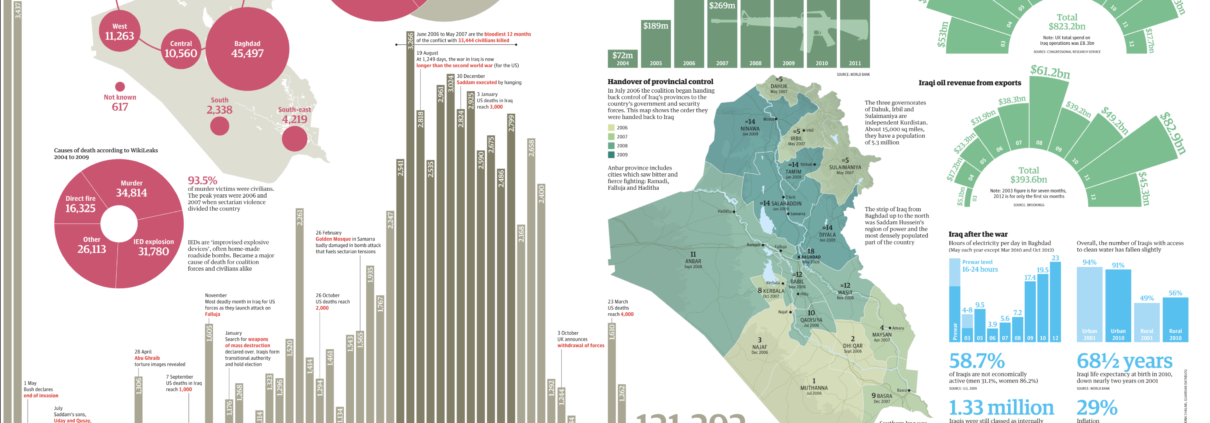
2014 War in Afghanistan – Scruton/The Guardian
The Guardian has become known for its prolific and often masterful use of infographics. This piece by Paul Scruton deploys multiple visualization techniques ranging from a coxcomb diagram to several different bar graphs to dissect an equally wide range of aspects of life in Iraq amid the consequences of the invasion, 10 years after the fact. While there is almost too much to look at here, this reinforces the graphic’s point about the mammoth scope and extent of the changes to this country because of the war. The level of detail is extremely impressive, and the color scheme does a good job of breaking up the elements into groups that can more easily be studied.
http://www.sciencemag.org/site/feature/data/hottopics/afghanistan/visualization/index.html


