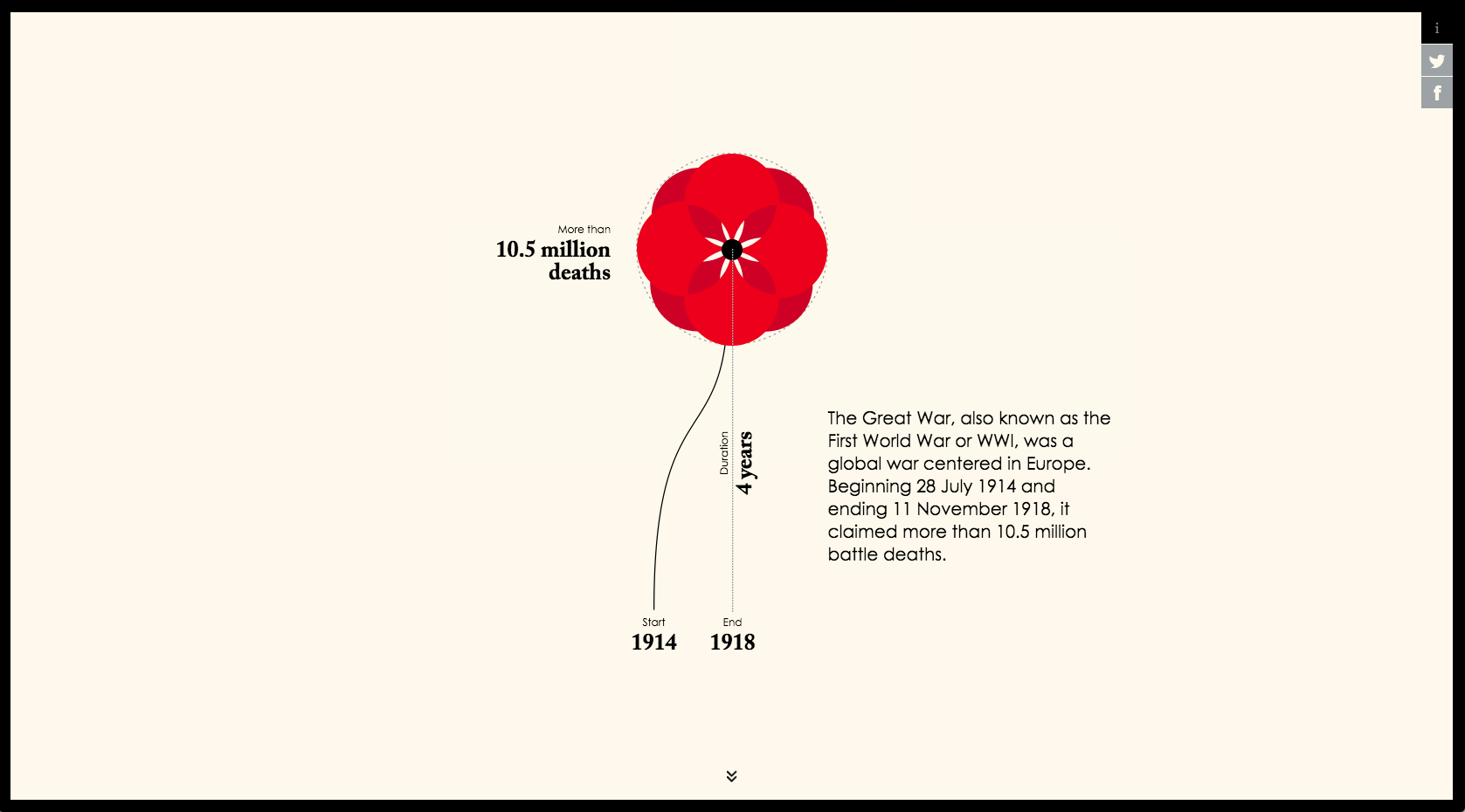
Data as Memorial: ‘Poppy Field’
The title of Valentina D’Filippo’s ‘Poppy Field’ has its origins in a poem written by Lieutenant Colonel John McCrae in 1915.
In Flanders fields the poppies blow
Between the crosses, row on row,
That mark our place; and in the sky
The larks, still bravely singing, fly
Scarce heard amid the guns below.
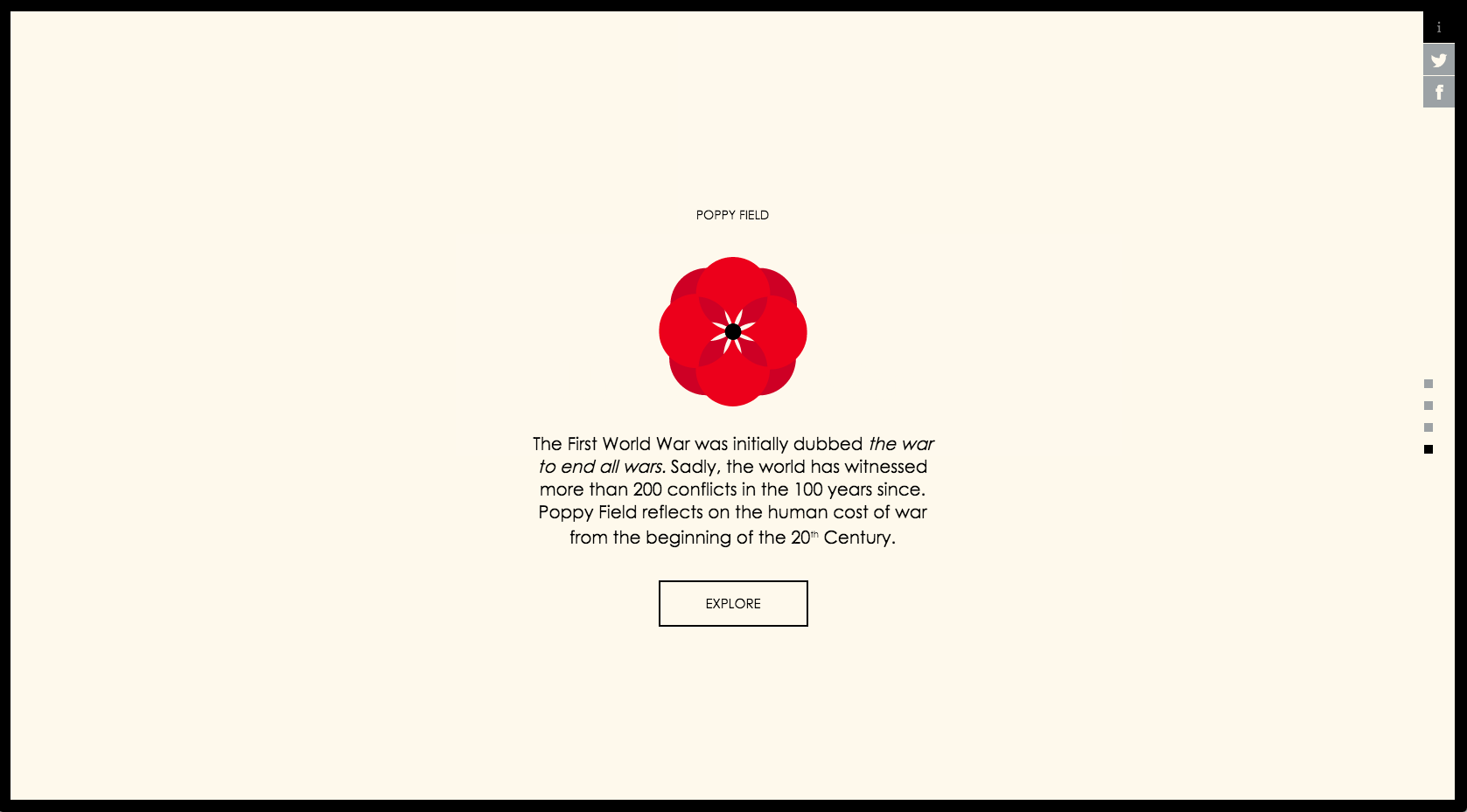
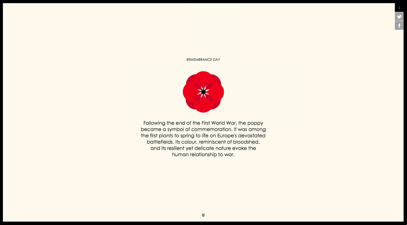
Largely because of this poem, poppies were established as the flower of remembrance after the First World War, in which Lieutenant Colonel McCrae died. They continue to be worn in commonwealth countries on Remembrance day. ‘Poppy Field’ was published on Remembrance day in 2014, marking the centenary of when “the war to end all wars” began.
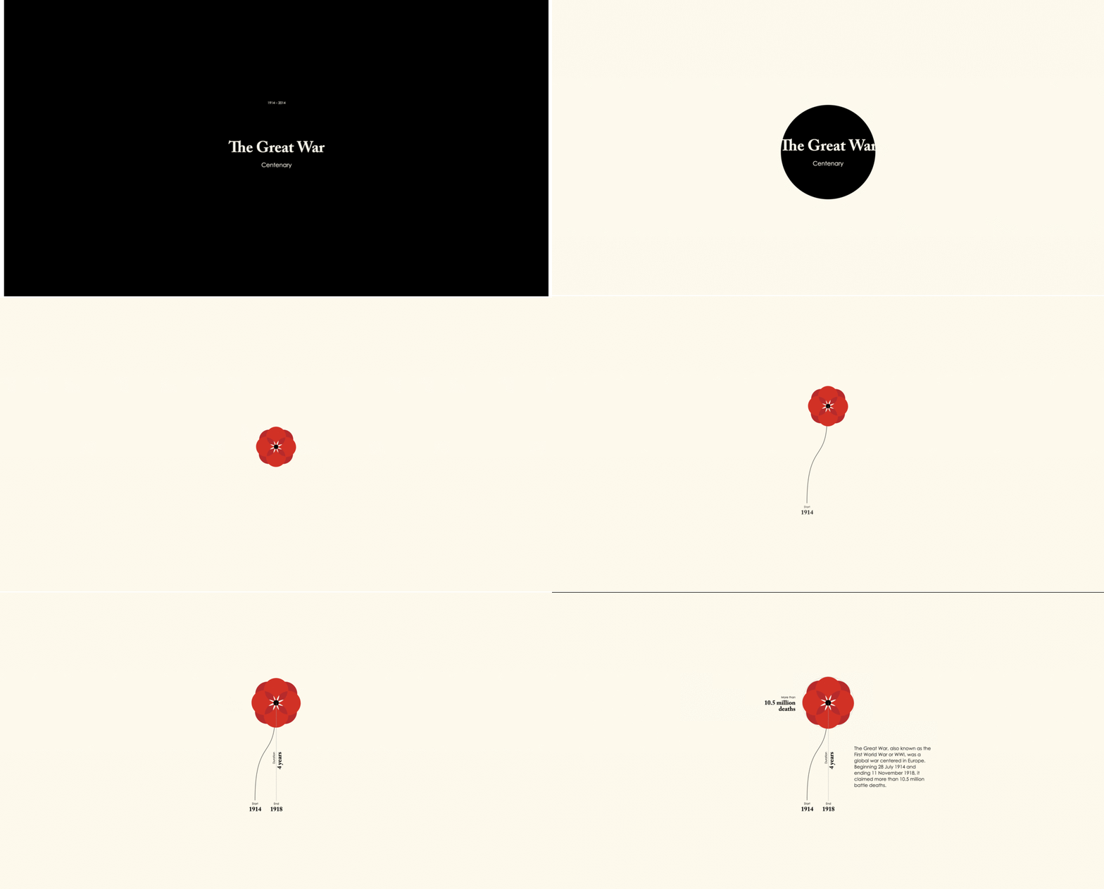
D’Filippo represents the dead of the wars leading up to- and after- the “war to end all wars” with flowers that symbolize remembrance of it. The interactive’s opening slides sum up what everyone knows: “The sacrifice of lives did not end” with The Great War, and indeed warfare escalated in previously unimaginable ways after this point. D’Efilippo uses this bitter and brilliant conceptual frame to provide “a reflection on human life lost in war.” In the process she works towards ensuring that the 20th Century’s astonishing loss of life in warfare does not become “scarce heard amidst the guns below” as other contemporary conflicts take center stage.
World War I is the foundation of ‘Poppy Field’ and this reference extends beyond the use of poppies and the centenary. The black and white opening slide of the interactive suggests the title cards in silent movies, and the design of the poppies themselves was also probably strategic. With their long, gently curling stalks and stylized blossoms, there is a subtle nod to the organic elegance of Art Nouveau, a relatively contemporary and highly influential art movement. With regards to the design of her data visualizations, D’Filippo has stated that “I also do not enforce a personal aesthetic preference, but I rather adopt a different style for each outcome, based on the subject represented.” The styling and references are subtle, but add another dimension of elegance and depth to the interactive’s data presentation.
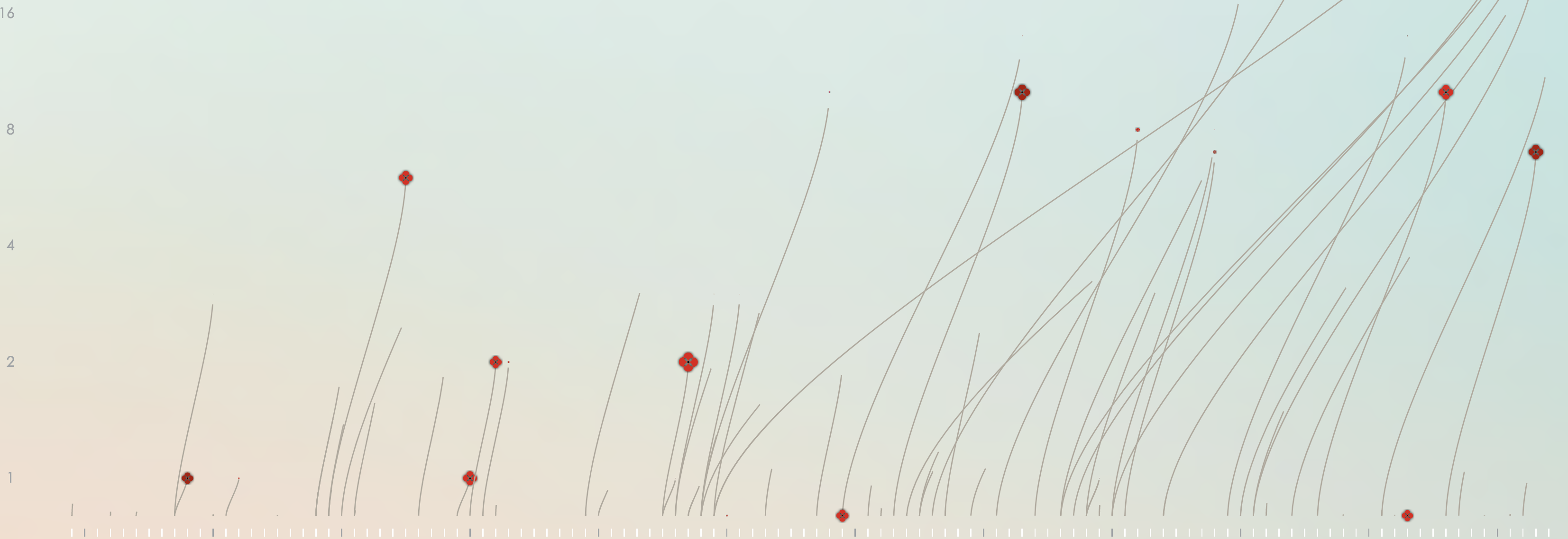
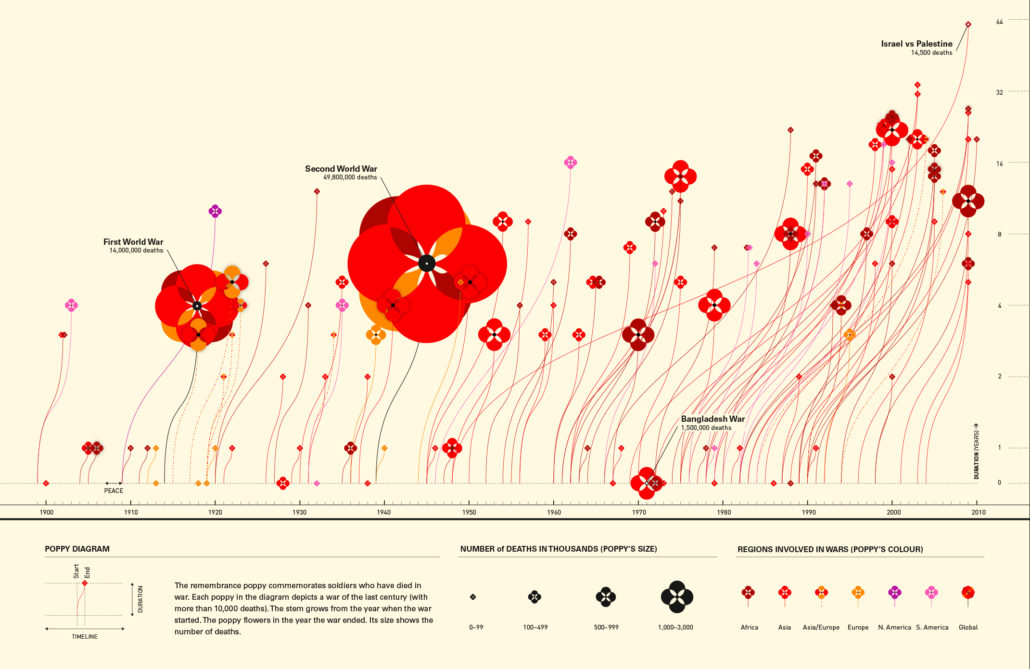
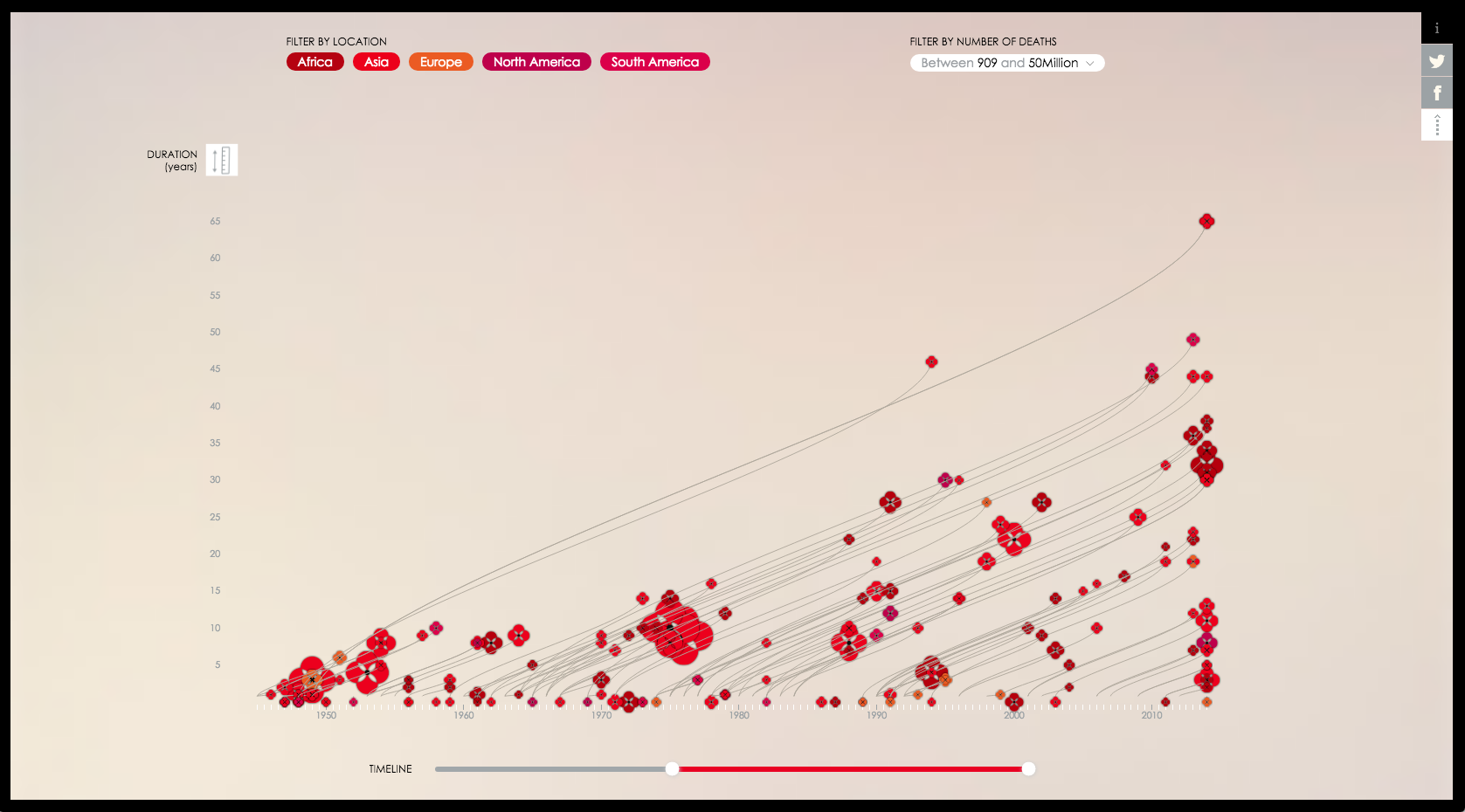
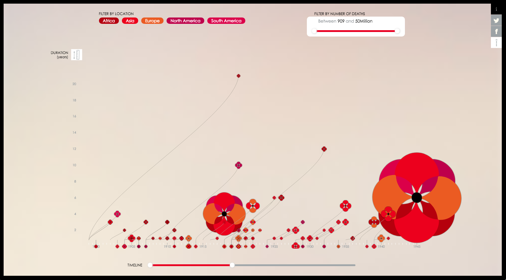
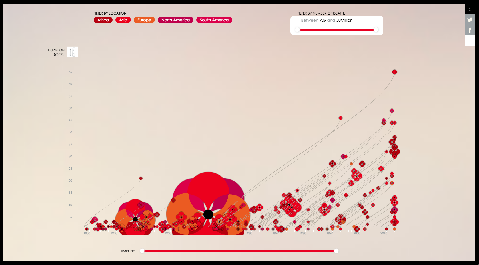
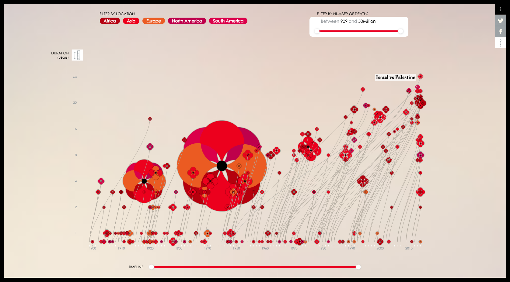
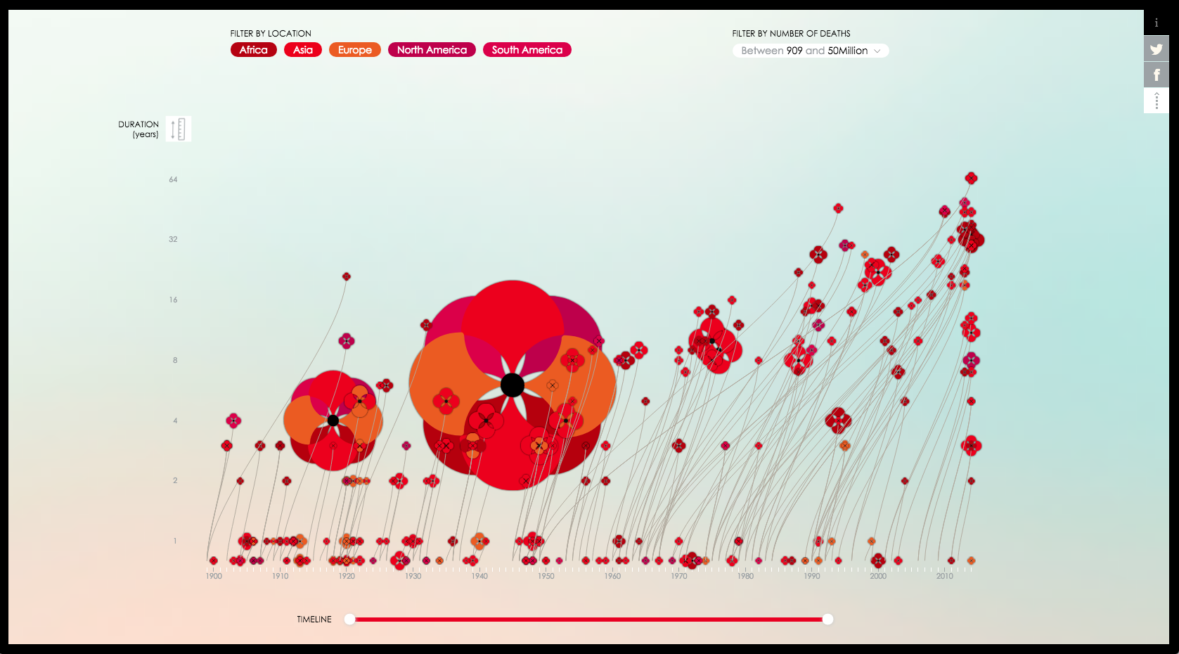
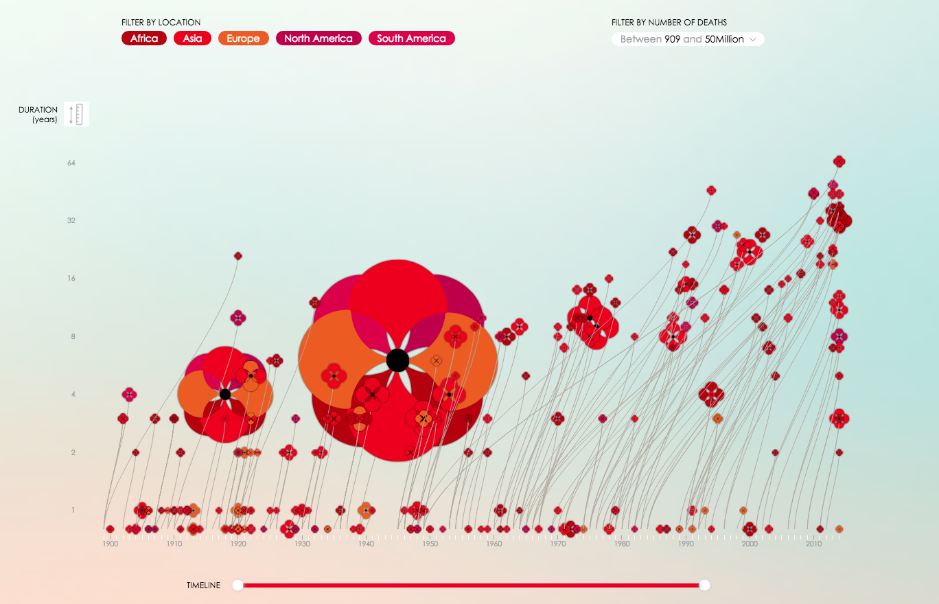
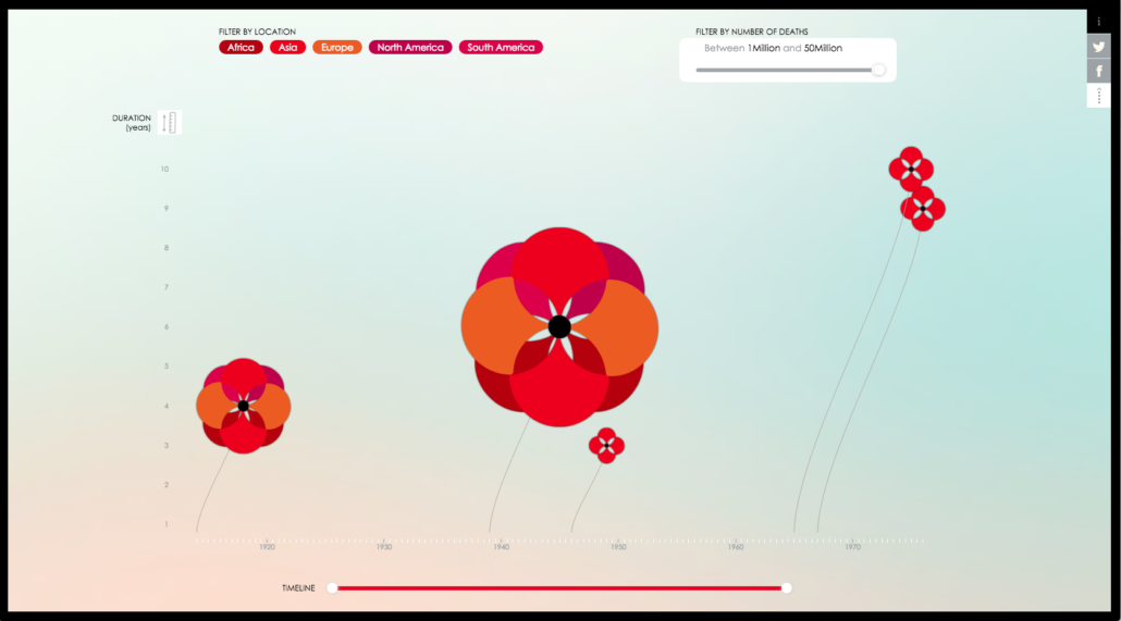
The variables immediately shown in ‘Poppy Field’ are the years of a conflict, its duration, number of fatalities, and regions (by continent) involved in the conflict. As D’Filippo explains, “the stem grows from the year when the war started and the poppy flowers in the year the war ended. Its size reveals the number of deaths and the variation of colour represents the areas involved.” D’Efilippo spent a lot of time on the design of the poppies’ flowers especially, calibrating the artistic references in relation to functionality. She has shared some of her sketches from the project.
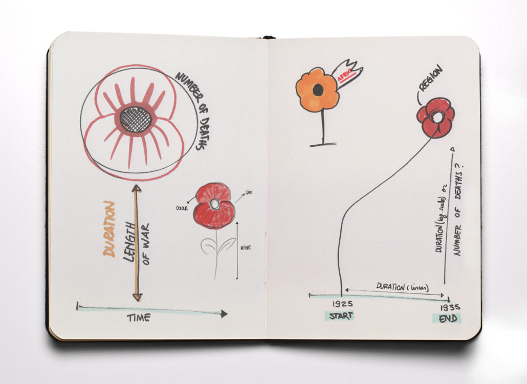
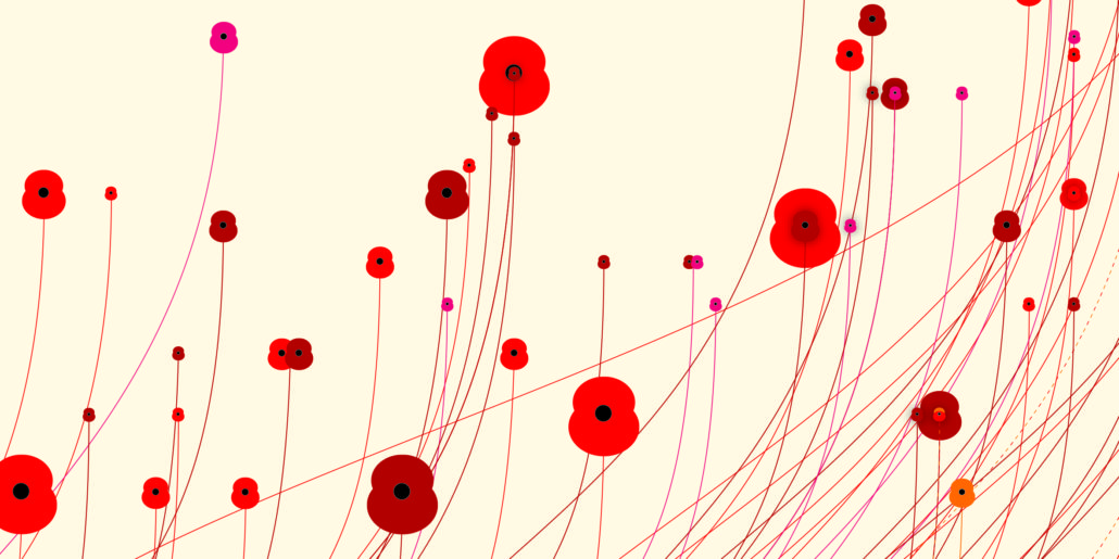
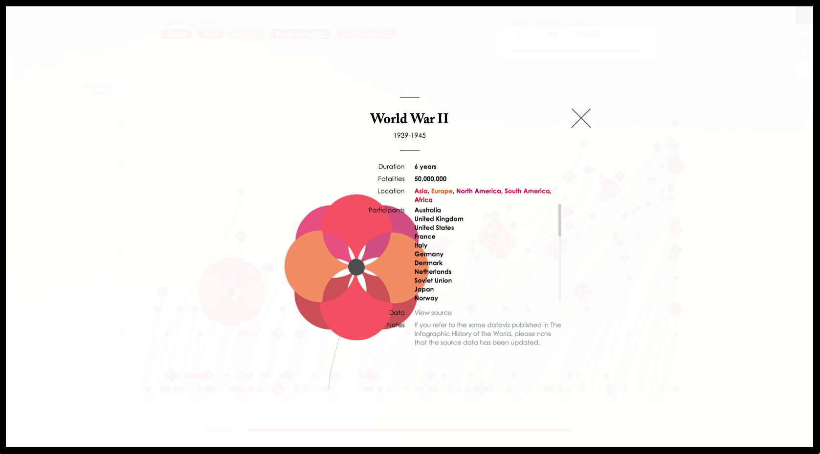
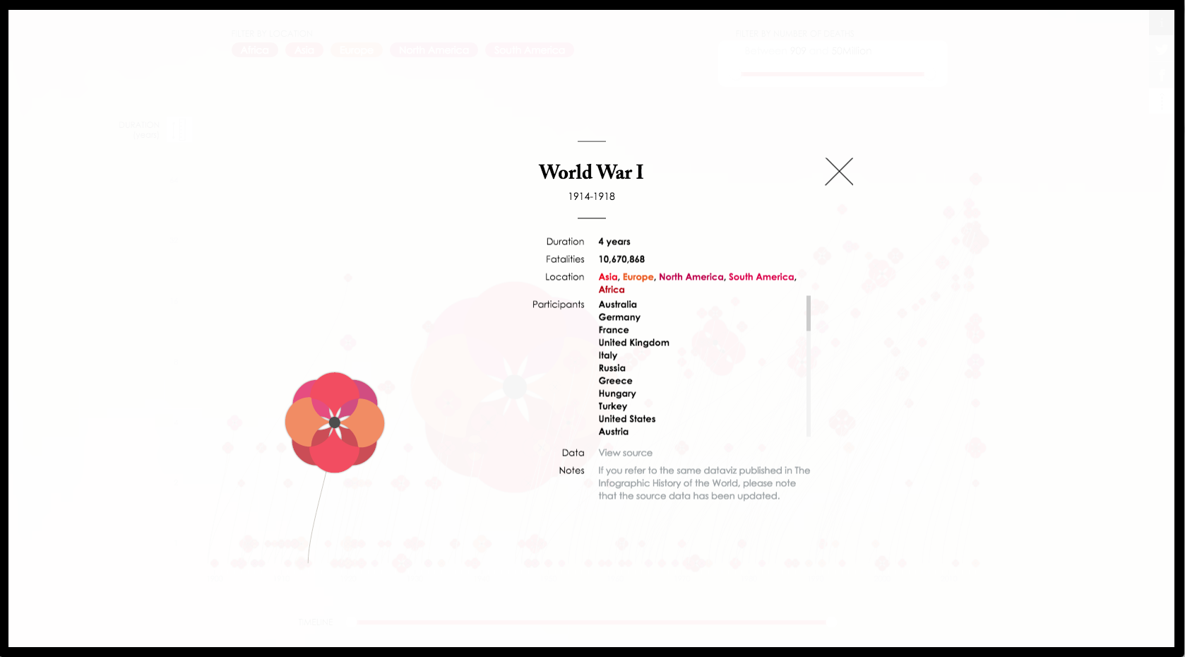
One of the principle challenges was choosing adequately distinguishable colors for the various continents while still making the flowers look like poppies. She achieved this with a pure, saturated, classic poppy red, and then the addition of darker, more yellow and more purple variations. When it came to constructing the flowers, the most obvious way to deal with multiple-region conflicts would have been to have a petal for each color. D’Efilippo found a more unique solution with pairs of petals. The default is two pairs, but with the World Wars the four continents involved were each represented by a pair. The structure of these petals also leave a small amount of empty space near the heart of the flower, which lightens it and adds depth to both the smallest and largest in the array. The end result is that while effectively showing two separate variables, the flowers also really feel like flowers.
The poppies deservedly take center stage in this interactive, but the slow, gentle shift from sky blue to rose in the background of ‘Poppy Field’ is stunning and also vital to the interactive’s success. The second verse from Lieutenant Colonel McCrae’s poem reads:
We are the dead, short days ago
We lived, felt dawn, saw sunset glow,
Loved and were loved, and now we lie
In Flanders fields.
This animated background gradient subtly recalls the dawn and “sunset glow” that would light a real field of flowers like the one Lieutenant Colonel McCrae described, whether near a battlefield or over a graveyard.
When the interactive’s field opens to the user, the stalks unfurl across the screen- almost seeming windswept- and the poppies bloom with an effortless randomness. It feel like something natural, which is incredibly difficult to achieve in programming. D’Efilippo’s friend, Nico Pigelet, an interactive developer, is responsible for this nuance. Of their work together, she said that “In exploring alternatives outcome that could deliver a more comprehensive representation, collaboration was key.” These more comprehensively represented components elevate ‘Poppy Field’ from an interactive that looks like its title to one which feels like its title.
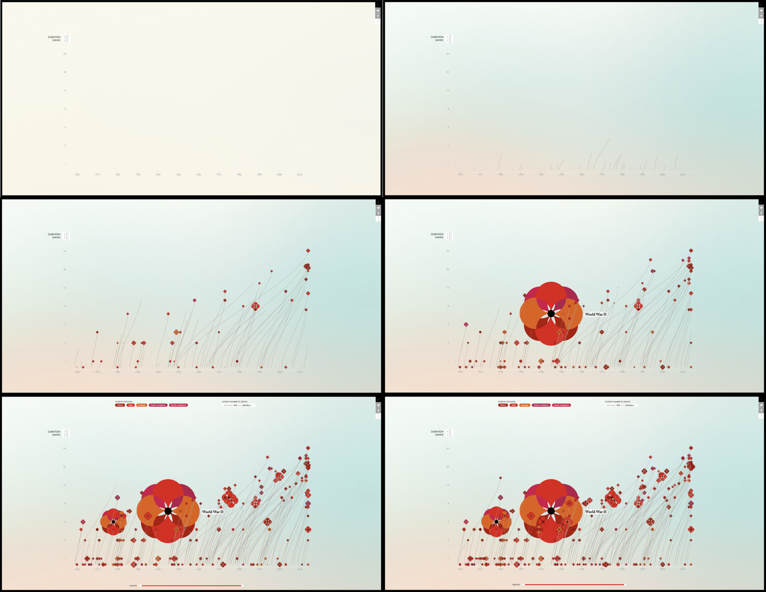
Another important design choice was keeping all of the flower stalks a slim, uniform width and the same soft but present brownish grey. Because of the color and weight, they do not visually compete with the colors and sizes of the flowers, which is important aesthetically, but is also essential for effective visual analysis of ‘Poppy Field.’ The color and size of the flowers represent two of the main variables, and D’Efilippo maintained the visual hierarchy she needed to draw focus to them. Choosing somewhat familiar flowers like poppies also means that users will instinctively establish the flower size that looks the most natural with the stalk width as a baseline conflict size. Because the stalks are uniform, this helps to reinforce how unnaturally, distressingly large the World Wars feel, especially the second one.
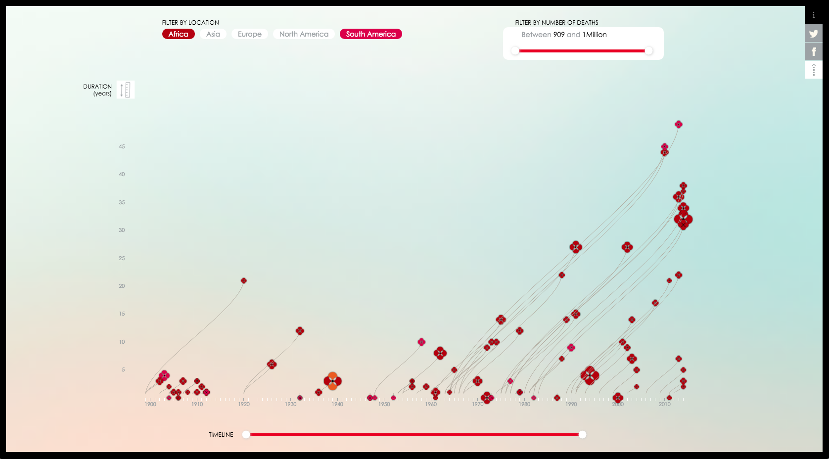
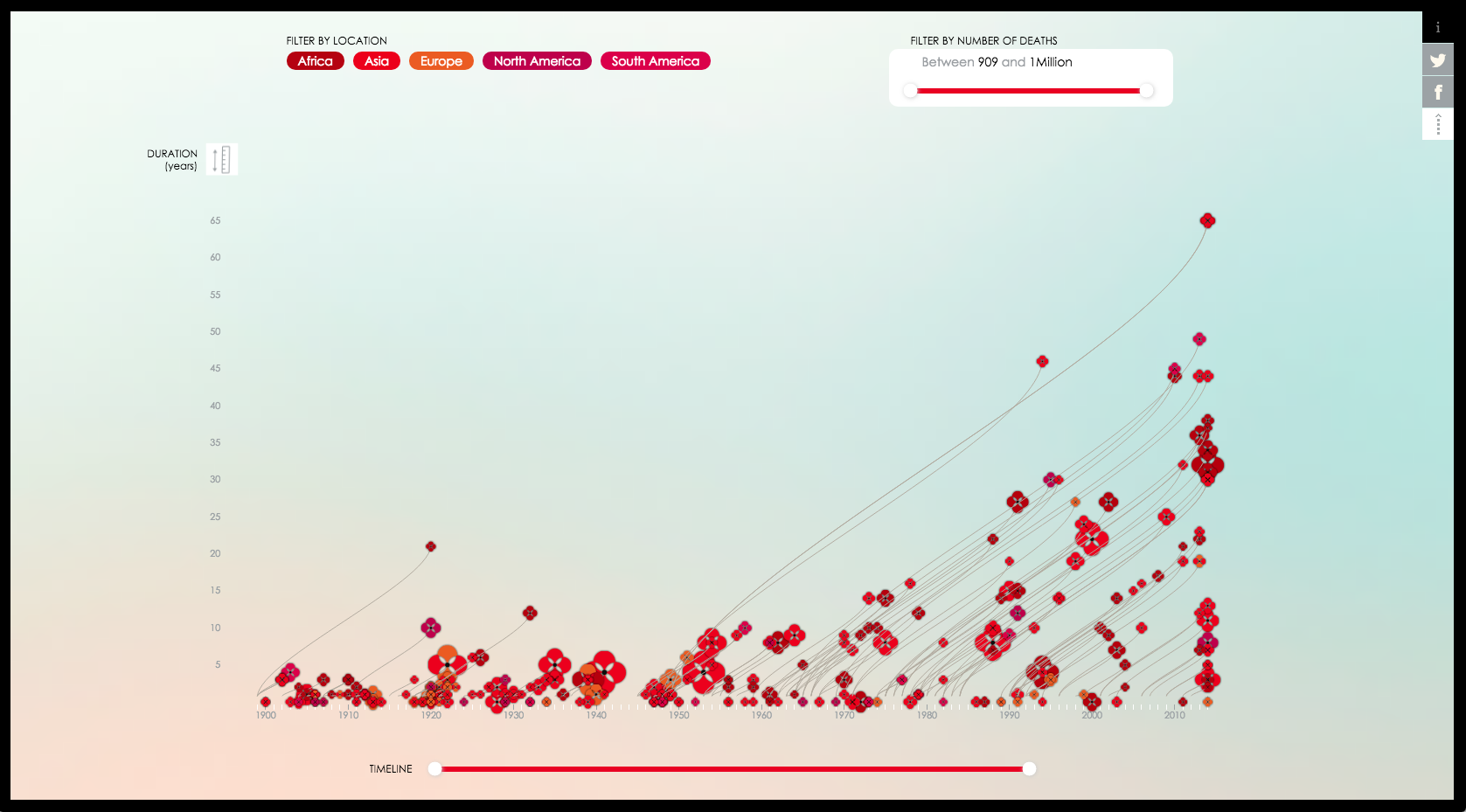
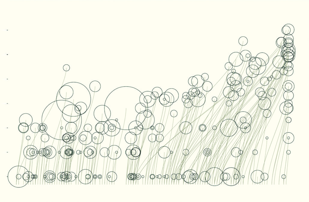
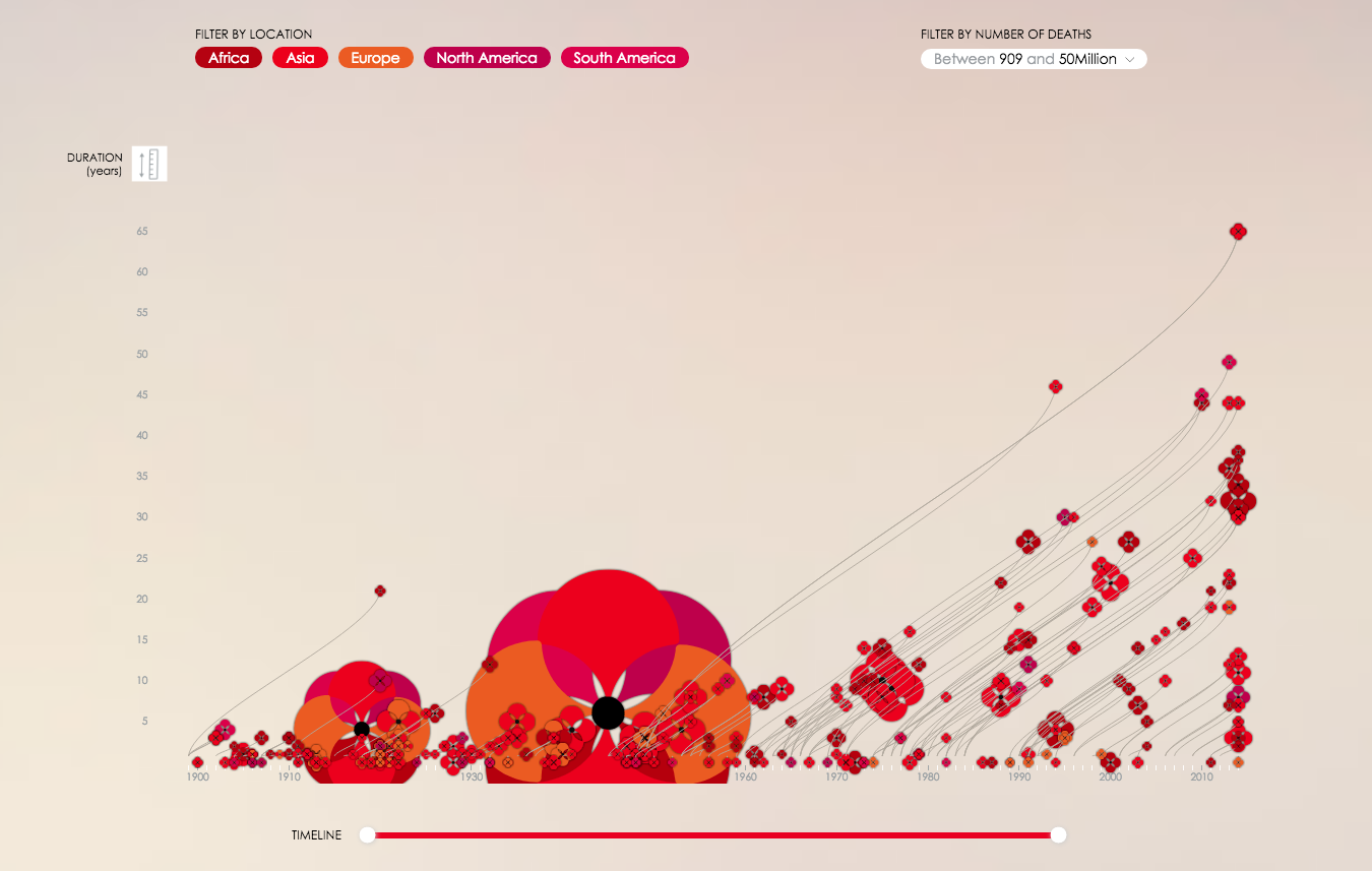
By default, ‘Poppy Field’ shows a logarithmic distribution of the data. This can be changed to a linear view by clicking the scale icon at the top of the y axis. When ‘Poppy Field’ is in linear view, the stalks make it possible to see how the nature of conflict changed after the World Wars. A visual analysis informs the user that conflicts took about the same death toll, but they became far longer. In the first third of the 20th Century, only three conflicts lasted more than a decade, but after the World Wars there are over 20. The user is given several options by which they can customize and interact with the chart to focus in on trends like this- for example looking specifically at certain years on the responsive timeline at the bottom.
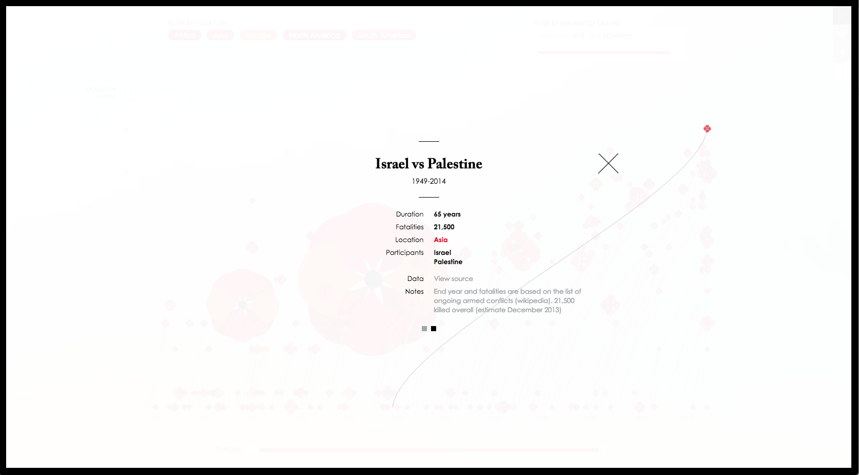
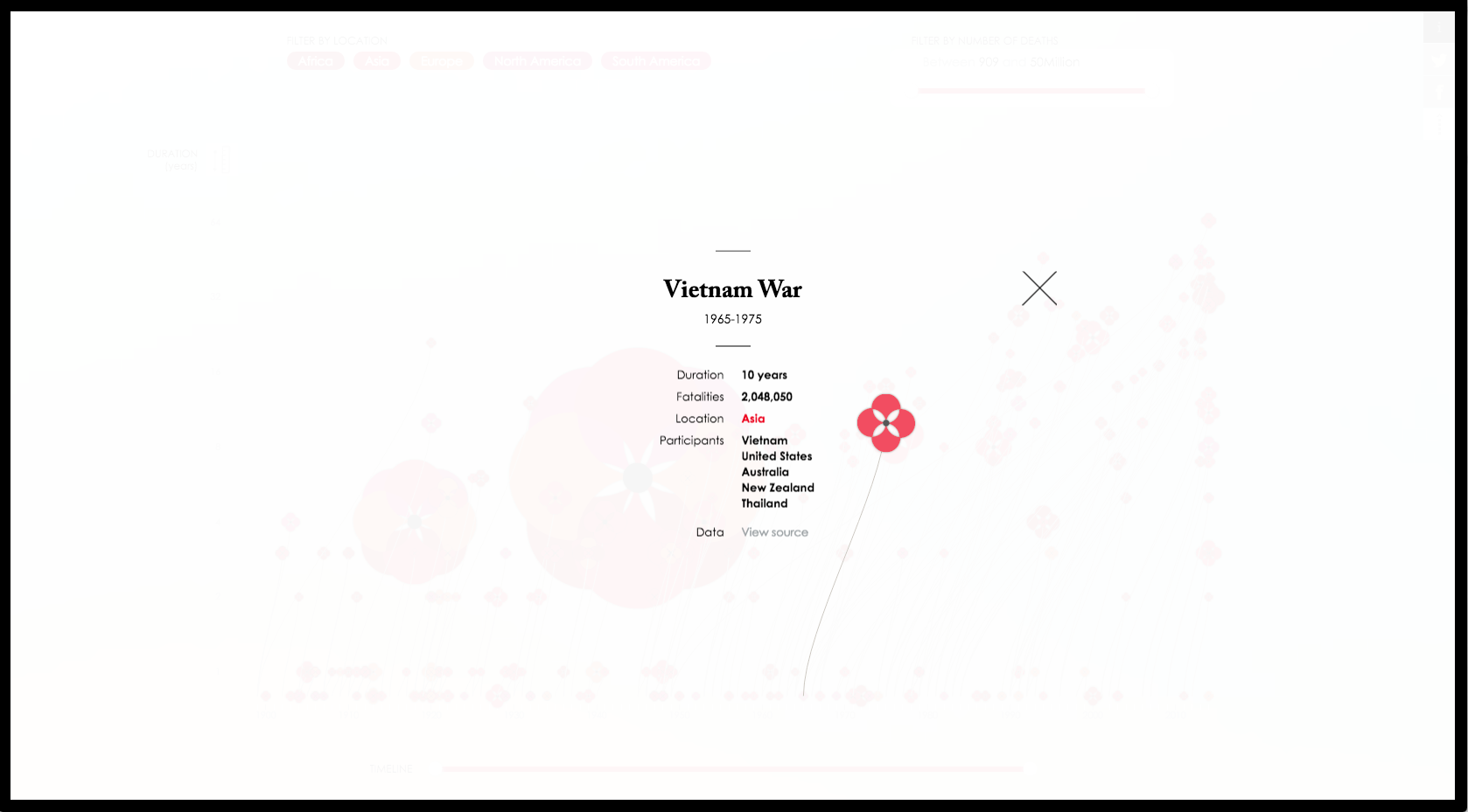
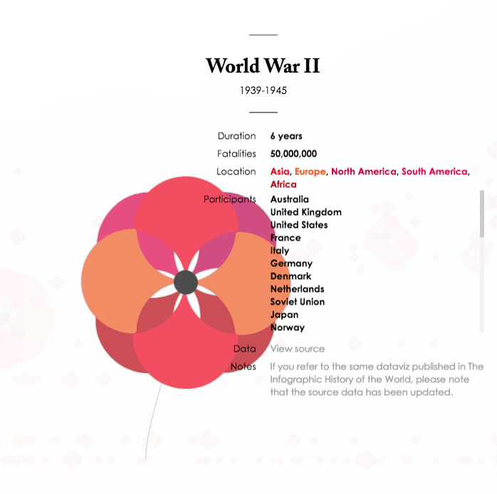
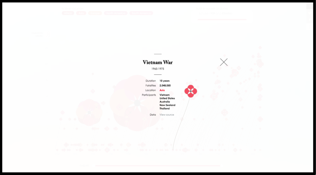
Hovering over a poppy in the interactive outlines the stem and flower in white, almost making it glow. A tag appears next to the flower with the name of the war. Clicking on the flower or its tag silhouettes that poppy against a white backdrop, and brings up information about the war, including the time period, duration, region, participant countries, fatalities, the data source, and any notes associated with it. Returning to the full array is easy and intuitive, and as the user moves through the data, this strategic experience helps to focus their interest on a given conflict at a time. D’Filippo achieves this both through the outlining of the flower, and also through the isolation of the single flower and the data it presents.
It is worth noting that when a conflict is selected, the flower is highlighted exactly where it is on the timeline and its size does not change. A trend in interactives recently has been “picking up” the selected item when it is clicked and aligning it to a standard position on the screen. Often this is accompanied by zooming in on the element. Leaving the flower exactly where it is and as the data has rendered it is a brilliant move that keeps the user’s place for them when they return to the main array. There are so many conflicts that without devices like this, it would be easy to get lost and overwhelmed, especially because of the subject matter.
Because of the large data array, there are many instances in ‘Poppy Field’ where the data overlaps, sometimes producing the same flower. For example, the conflict “India vs Pakistan, Kashmir Dispute” has the same time period and approximately the same fatalities (24,376) as “Turkey Gov vs Kurdistan Guerilla” (28,655). Both ran from 1984 to at least 2014 when the interactive was published online. The South Sudan Civil War and the Syrian Civil War have a similar overlap, as do the Cuban Revolution and “Indonesia vs PRRI, Permesta and Darul Islam.” There is at least one case of a three war overlap, with the First Sino-Tibetan War, the Paraguay Coups, and the Italo-Turkish War all occuring during the same year, though the fatalities had a wider range.
These overlaps are fascinating in their own way, drawing powerful connections through the mass of familiar and (to the West) more obscure 20th Century conflicts. However, making these connections requires knowing that they are occurring. To deal with this issue, if one of the overlapping conflicts is clicked, two squares appear at the bottom of the information box, echoing the device used in the opening slides to show how many pages there were to click through. Clicking between the squares here brings the user back and forth between the obscured conflict and the one they originally clicked on.
In another data visualization of this magnitude, it might be too much to hope that an average user would actually spend enough time to encounter nuances like this. However, D’Efilippo reports that “On average people had a lengthy interactions with the website, meaning they were interested in learning and reading the content.” It is easy to tell from the level of depth and strategic thought that has been put into ‘Poppy Field’ that this was an important goal for D’Filippo. The interactive grabs a user’s attention through aesthetics and emotion, but holds that attention through intellectual engagement with a fascinatingly presented subject, commemorating and educating in equal measure.
‘Poppy Field’ was entirely conceived of by D’Efilippo, and was originally a passion project that she included in her book, The Infographic History of the World. She made it with Adobe Illustrator and the static piece provides an interesting comparison with the interactive, though there are few structural differences. D’Efilippo said in an interview that “the initial outcome, which was printed in the book, was limited by space and the static nature of the medium.” She worked with her friend Pigelet to overcome these limitations and fully realize the potential of ‘Poppy Field.’
De’Efilippo got her data for the original static infographic from the Polynational War Memorial website, and each conflict information section includes a link to its corresponding page on the memorial site. On one of her pages about the project, she shows the dense Polynational War Memorial data that she directly worked from. Possibly referring to the varying accounts or data gaps of many historical conflicts, D’Filippo admitted in an interview that there was “some limitation with content and data source.” However, she explained that “I came to appreciate that “it’s ok” to offer a relevant way of looking at the subject, rather than provide beginning-to-end conclusion.” ‘Poppy Field’ is a narrative tool for reflection, comparison, and trend-finding, not a war database, so this is an entirely reasonable outlook.
There are very few flaws to this interactive. A search function would have been useful as it can be difficult to find wars in the tangle of stems just by hovering over them. The most important addition would have been to include a brief summary of the conflict. It can be extremely challenging to summarize wars which may be decades long and involve the loss of untold lives, but adding this element would have made the interactive more self-contained and complete. An alternative would have be to have a tagline at the bottom of each conflict page attributing the data, and then also include a call to action along the lines of ‘Learn about the …. War here.’ This would link to the specific Polynational War Memorial page for that war. It is a small but notable change that would have upgraded the learning possibilities of the site. Finally, the ability to switch between log and linear displays could have been more intuitive, and unfortunately ‘Poppy Field’ does not work on mobile devices.
One final element of the interactive that is conceptually askew, if not actually a flaw, is that ‘Poppy Field’ does not actually begin with World War I, but rather the beginning of the century. Going from either 1914 to 2014, or 1900 to 2000 would have been cleaner. Still, as always, D’Efilippo made the most interesting choice. This timeframe contextualizes the first World War while bringing personal, contemporary stakes to the 2014 users this interactive was designed for. Also, for the wars that began before 2000 but continued to the 2014 present day, cutting these short would have been unintuitive and disconnected users, aside from slightly skewing the visual trends.
All of D’Filippo’s interesting choices rest on a solid foundation of experience and her strategic perspective on data visualization. Her self-described “research-based approach to evaluation and design” is one that Edward Tufte, one of the great theorists of visual data analysis, would have fully endorsed. D’Filippo is an artist, researcher, and incredible conceptual strategist who studied industrial design and worked commercially for a few years before fully pursuing her passion for data visualization.
‘Poppy Field’ has been featured in a book on excellent data visualizations and received several awards. It won silver in the 2015 European Design Awards in the information site category. It has received a significant amount of press and acclaim, including mention in the 2015 Kantar Information is Beautiful Awards. D’Efilippo has made a large amount of data visualizations on various topics, most of them fascinating. For example, she returned to the concept of data as memorial in 2016 when she produced a series of visualizations in the form of records to honor David Bowie’s death.
D’Filippo says that she sees data visualization as “the connector between the various skillsets. It’s a blend of illustration, art direction and the rigorous user focus approach of industrial and interaction design.” In the same interview, she explained that “the visual should provide clarity on the story’s topic and connect with the audience – but at the same time, it must be functional and become the vehicle to deliver and clarify the data insights.”
‘Poppy Field’ is beautiful, but always for a reason, and its aesthetics never interfere with its functionality. In it, D’Filippo has achieved a seamless integration of the “substantive, statistical and artistic” that Tufte advocates for. ‘Poppy Field’ embodies this mindset and is set apart by D’Efilippo’s fierce, beautiful realization of it. With clean lines, rich colors, and soft but clear technical elements, ‘Poppy Field’ is a masterstroke in effective data visualization. It injects pathos into data without obscuring or misrepresenting that data, and imagines the cost of a century of war by taking the user outside to a field fenced in by time, to wander through flowers of remembrance.
SUBSTANTIVE REFERENCES:
D’Efilippo, Valentina. “Poppy Field.” Valentina D’Efilippo. Accessed May 04, 2018. http://www.valentinadefilippo.co.uk/projects/poppy-field/.
D’Efilippo, Valentina. “Profile.” Valentina D’Efilippo. Accessed May 04, 2018. http://www.valentinadefilippo.co.uk/about/.
Globus, Al. “Principles of Information Display for Visualization Practitioners.” Ames Research Center. November 28, 1994. Accessed May 02, 2018. http://www2.cs.uregina.ca/~rbm/cs100/notes/spreadsheets/tufte_paper.html.
“John McCrae.” Wikipedia. Accessed May 05, 2018. https://en.wikipedia.org/wiki/John_McCrae.
Kirk, Andy. “Six Questions With… Valentina D’efilippo.” Visualising Data. June 21, 2016. Accessed May 04, 2018. http://www.visualisingdata.com/2016/06/six-questions-valentina-defilippo/.
“Lieutenant Colonel John McCrae.” Veterans Affairs Canada. Accessed May 05, 2018. http://www.veterans.gc.ca/eng/remembrance/history/first-world-war/mccrae.
“The Story Behind the Remembrance Poppy.” The Great War. Accessed May 05, 2018. http://www.greatwar.co.uk/article/remembrance-poppy.htm.

