Categories
Lucas Enrique Fernandez

Breaking Down An Image

Progym: Impersonation

In our daily lives, we see a wide array of images, however while we do see these images we rarely take the time to analyze and understand them. The visual rhetoric hidden behind images hold power over people that create certain meanings and arguments based on the context and audience which surround the image. Take for example this advertisement on men’s deodorant:

This is a great example of Visual Persuasion in Advertising because in this  photo, the company Axe Men's body … | Spray print, Print ads, Background  for photography


Audience:

The audience is the intended target by the creator of the advertisement, which in this case is men. You can see this from how the background is of a man. The company is also known to sell men’s products, and the design of the body spray is black.

Context:

The company Axe sells body sprays, which are predominantly marketed to supposedly turn geeky guys into confident hunks that can get women. This is displayed by how the text asserts that wearing the spray will make the wearer more appealing.

Purpose:

The purpose of this advertisement, as with any other advertisement, is to sell their product to their audience.

Tone:

The tone of the ad is based on the author’s perspective of the subject, which seems to be that the body spray is a magnetic product that will attract anyone to those that buy it.

Arrangement (Location and Scale):

In the background is the largest scaled image of a presumably naked man, then closer in the foreground is slightly smaller text, and most predominantly in the foreground is the image of the body spray. All of these are centered in the middle of the ad. Both the body spray and the text are more focused than the man in the background and the light blue text immediately draws the eyes of the audience, showing what the message of the ad is supposed to be.

Text:

The words included in the ad are “spray once seduce a thousand” of which the underlying meaning is that the wearer will have a quick way to attract lots of women.

Typography:

The font size is fairly large and dominant in the image and the style is more serious as opposed to comical, which makes sense given it is supposed to be a serious ad targeted to men about increasing their chances with women.

Color:

The color featured the most is black, which is considered more masculine which should interest men in buying the product. Blue is also added for contrast to make the text stand out.

Connotation:

The splash and icy blue letters have the connotation of coolness, a feeling that is both refreshing and a way that a man wants to feel when approaching someone.

Readability:

The contrast between blue and grey/black makes the image easy to read.

Categories
Nathan Ryan Reeves Uncategorized

Breaking Down and Image; Description

We covered rhetorical images in the last post but are similar since the article has the same basic principles as the last one. How does an image make you feel, and what makes you feel that way? You can get the answer by breaking down the image according to the context, audience, and the purpose of the image, and the feeling that it is trying to convey and instill into the person. I feel like a broken record when discussing the concept of visual rhetoric since it all feels the same

“A picture can paint a thousand words, but a few words can change the story”

The quote explains this concept well since what you can get from the image can depend on the context, and the rhetorical strategies used. But what makes an image so powerful? What gives an image its power to a feeling?

Just like the reading from Cohn, the reading “Psychology of Rhetorical Images” mentions the difference between information and what is most apparent to the viewer. For instance, the difference between the most or least vivid information. Simply put, what is the most realistic information and what is the least realistic, like statistics. Images land more on the most vivid information part of the scale because it is a photograph of experience (below).

“…advertisers want to transform people… they want to compel people to buy a product without knowing why… as a visceral response to a stimulus, not as a conscious decision.”

Hill explains that pictures give an emotional and a stimulative response saying that the feeling you get isn’t a conscious decision, but rather how we feel in the moment without thought. Emotion is not this thing that can be thought about and controlled in the moment, but rather it is just what you feel.

What emotional response does the picture below give you? A happy feeling? Inner peacefulness? Maybe the feeling comes from the older man’s expressions, or maybe it is the bunny on his head that gives the image a more light-hearted feeling. What does the image bring to the table in terms of context? Rhetoric in images is broken down between purpose, context, audience, and the subcategories in those like tone and location.

To me, this image spoke out to me since I was looking for an image that would not be too hard to describe or investigate. It is perfect due to the casual nature of the image’s background, and the happy subject in the foreground. The context doesn’t need to be known down to the “T”, but visual representation can hold power in the emotion it gives off.

Image: http://
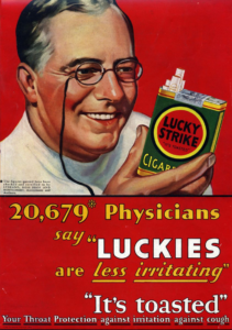
www.kickvick.com/77-powerful-photos/

Categories
Samuel James Conroy

Proverb Progymnasmata

Proverb Progymnasmata

            The writing in the article, “Breaking Down an Image,” is quite superb. Rhetoric images are not talked about a lot in the world of literature due to there not being many images typically instilled in writings. In this piece the author breaks down a system to decipher images in text to understand their true meaning. This is done by breaking down the analyzation into numerous categories. These categories are: Audience, Context, Purpose, Tone, Arrangement, Location, Scale, Text, Typography, Font Size, Font Type, Color, Connotation, and finally Readability. This was done because many people do not typically think about why images are placed where they are and how it persuades us. The main thing to consider when viewing an image is the visual rhetoric that it gives off, or the effect that is has on someone.

It is best to be in touch with the images that you are viewing or else you are putting yourself in a bubble of ignorance. This is the equivalent of not reading the news, so you don’t have to face the realities of life and view what is truly going on around you. Some may choose to live like this as that way they can go about thinking all is good and be a living embodiment of ignorance is bliss. One cannot hope to understand what is trying to be said to them unless they can accurately analyze what is being shown whether it is through images or writing, which “Breaking Down an Image” tries to service.

Categories
Catherine Dodd Corona

Visual Rhetoric

The Analysis of a Lucky Cigarette Advertisement.

Progymnasmata: Fable

Audience

This advertisement is targeting people who are debating quitting smoking. It highlights the new aspects of Lucky cigarettes that will mitigate the reasons to quit. It’s long words, the older physician and the product shows that the advertisement is targeting an older generation. 

Context

If you have ever seen Mad Men you may recognize this slogan and the background of the advertisement. Cigarette brands started losing sales when research groups published journals proving cigarettes harmful effects. Advertising companies started to combat media and scientists. One way they worked around the evidence against cigarettes is by showing a smiling physician holding a pack of lucky’s and a slogan that infers there are less harmful effects, coughing and irritation. They also reinforce the advertisements company own research saying that 20 thousands physicians say luckies are less irritating. 

Purpose 

The purpose of this photo which is an advertisement is to sell Lucky Cigarettes. 

Tone 

The advertisement is displaying a calm but exciting tone. It gives off the impression that there is new news. The smiling healthy physician gives a comforting tone and holds a neat inviting pack of cigarettes. Nowadays it has a vintage look but back in its day it would have fit in with other advertisements nicely.  

Arrangement
     Location

The photo is split in half the top half showing the jolly faced physician and the bottom half shows the slogan. The arrangement is nice and forces the eye to go to the slogan first, then with the surrounding information complimenting the information and tying the image up nicely.

     Scale 

The scale works, the consistent red color ties the top half with the bottom half. I do wish the words were a different size so they fit together nicely. The words seem a little misplaced, and childish.

Font 

The font changes quite a bit in this advertisement, which makes it look haphazard. There are lots of smaller symbols like quotation marks, which while necessary are distracting when displayed like such. The change in color while trying to highlight the important words, in my opinion is also quite distracting. I like the advertisement but the words and font are not my favorite. 

Connotation

The red that is presented in several places on the image ties everything together. The red is also a very exciting color. It infers blood pumping, warmth or power. The rosy cheeks of the physician is also a signal of warmth along with his comforting grip. The subliminal messages are all leading towards an exciting but comforting new release. 

Readability 

 This image is very readable. It has a point and all the different aspects are trying to prove that point. Besides some small distractions this advertisement is clear, concise, and effective. 

Categories
Simona Barca

The Psychology of Rhetorical Images

In “The Psychology of Rhetorical Images,” Charles Hill uses comparison to describe the differences between several types of rhetorical devices related to imagery. On page 37, for example, Hill describes the difference between persuading and transforming people. As Hill describes, advertisers aim to transform people, not persuade them. While these seems counterintuitive, Hill’s explanation makes sense, saying that persuading people implies the need to stop and think about the situation and then make an educated decision. In advertising, however, the goal is to transform people in that they automatically associate the product in the ad they are watching with a positive reaction that automatically makes them want to buy the product. It doesn’t give them time to think about the product or why they want it, it just makes them automatically want to buy it. Hill makes a great comparison between these two points, explaining to the reader why one is preferable to “professional persuaders” over the other, even though they may seem similar or counterintuitive at first glance.


Categories
Phillip Wade Wilson

Breaking Down an Image, but what about presence? – Comparison

Above is a photo I found of an extremely emaciated polar bear, one that the photographer claimed only had a few days left to live. How did it make you feel? What were your initial thoughts when you saw it? Did you think of climate change and the impact humans have on the natural world? Did you think of the barren environment in which the bears live?

I wanted to continue on with another post similar to my last one on the usefulness, and power, that can come with images. We read Cohn’s piece on what images do for us and how they shape our lives, but this week’s readings delve a bit deeper into the “why” and “how” surrounding this topic.

Most of what is found in Breaking Down an Image, by Sheffield, is a continuation of Cohn’s work. She gives us a few basic ways to understand how a photographer or advertisement company might set a photo up as, but in my opinion, she fails to give us something new to push the bounds of what we already know about rhetoric. In the Psychology of Rhetorical Images, by Hill, he establishes something I never even thought of when it came to understand the “why” and “how” of an image and that is presence.

“the desired element receives the greatest amount of presence from being directly perceived”

Hill is explaining that words can only do but so much for us as humans. We want to experience things to fully understand them, and many of us (myself included) have difficulty understanding complex situations until we, ourselves, are faced with them. A photo, video, or some sort of visual representation is going to be the next best thing for us to be able to experience what we have not, and in this case, we are experiencing the sight of what happens when a habitat is reaching full destruction. The presence images have, especially in cases where a change needs to be made, can be vital. This photograph from 2015 garnered a huge following as it is quite undeniable that there is clearly something wrong and that something is the way humans have treated our environment.

More on the polar bear photo here: https://www.cbc.ca/news/trending/thin-bear-photo-kerstin-1.3232725

Categories
Paula I Arraiza

How to Analyze an Image

Type of Progym: Confirmation


In “Breaking Down an Image”, Sheffield does exactly what the title of the article states, she breaks down an image. The author uses a picture from a watch advertisement to explain various rhetorical elements that are commonly used with images. She lists various elements that are helpful when analyzing an image. Many of these elements are somewhat self-explanatory, such as figuring out the purpose, audience, and context of the image. However, other elements she mentions are things we wouldn’t usually think twice about. For example, she mentions the placement and size of details are important since something more important could be a larger component of the picture than something than isn’t as important. Similarly, to what Cohn mentioned in last week’s reading, the color and size of the font used can also be important when analyzing an image. In short, Sheffield tells is guiding us to focus on the small details we wouldn’t think twice about when analyzing an image since the creator of said image did everything with a specific purpose. Her advice and explanation of specific elements would definitely come in helpful when examining or creating an image.

Categories
Aongus Mui

The Rhetoric of an Image (Proverb)

Proverb of Breaking Down an Image

One of the most revolutionary items in modern day is a simple image. Images are made up of countless elements like color, mood, and most importantly context. Images are part of our daily lives. According to Jenna Pack Sheffield, “Visual rhetoric is a means of communication that uses images to create meaning or to make an argument.” (Sheffield) This is one of the main themes in her passage. Sheffield stated this to demonstrate that even though pictures seem ordinary, many of them have a far deeper meaning and can persuade us without our knowledge.

Humans are all hardwired to keep memories, it is only natural for us. But how many memories can you recall before some begin to slip away? This is where images come in, they help us secure our brightest moments, with no chance of being forgotten. Something that is often related to images are texts. Texts like articles or poems may be able to paint a picture in your mind but they will never be able to fully recreate an image that the author has in mind. Images are one of a kind, they show off many different types of components. Some of the components mentioned by Sheffield are purpose, tone, and scale; all of which are crucial to creating an image. The power of images are displayed by how all of the elements fit together, giving the audience a particular feeling only achievable by vision.

To conclude, images are all around us, we see them digitally, in stores, and quite frankly everywhere. Pictures can be of great influence to us, they exhibit many moods and objects specifically put there. Advertisements for example are images that have persuasion, they encourage consumers to buy a product. Images have the ability to influence us into wanting to do something or vice versa.

Categories
Samuel E Evans

“The Psychology of Rhetorical Images” by Hill, “Breaking Down an Image” by Sheffield

Progym: Thesis or Theme

How effective is propaganda? Well, considering I have multiple pieces of it hanging on the wall in my apartment and nobody ever questions it, I would say it is quite effective. Well-designed propaganda is imagery that sticks with us, that we feel a real familiarity to, and which also deeply convinces us of something, even if we don’t realize it.

These two posters I have, tacked up in the living room, wrapped in clear plastic leaf, are replicas of iconic British WWII propaganda, given to me by my grandfather. My grandfather is very proud to have “lived through the war,” even though he was only born in 1943, and he is also a proud Brit, as are most of my family. The posters, one of a “German & British Fighters & Bombers” warning and the other the classic “Keep Calm and Carry On,” exemplify this pride, and to my grandfather’s generation and above they convey almost as much patriotism as the Union Jack itself.


In her piece, Sheffield writes about the rhetorical situation of images which can be used to make an argument. The argument differs somewhat between these two pieces, but they are still very similar. For one, their audience is the same: both target the war-era British public, and the context is also the same: both were made during the German air-raids on England. However, the purpose, which Sheffield describes as “the overall goal for creating an image,” differs between the two (Sheffield). The former is, while propagandistic, mainly concerned with educating the public to help promote safety. The latter, on the other hand, is propaganda at its finest. It evokes pure patriotism, with a bold font, full use of English red and white, and the image of the crown to top it off. Of course, the public warning poster utilizes similar strategies also, using large lettering, varying font, and stark imagery to help inform and elicit a cautionary tone. Something that Hill writes about that really resonates with me is that

“patriotism is an abstract and complex concept,” which he refers to as “a ‘value,’ not a feeling (Hill 35).

Patriotism, he says, goes beyond the usual emotion-inspiring imagery, but rather the patriotic images conjure patriotic value, which then spurs the multitude of emotions that are tied to that..

Some argue that British patriotism has been dulled, or even corrupted. During the 2012 London Olympics “Keep Calm and Carry On” was plastered all over the world, on t-shirts, commercials, mugs, and soda bottles, with all imaginable spins and puns being utilized. Here, people argued that the image of wartime solidarity and strength was being over-commercialized, ruined by its tacky application as bumper stickers and Dr. Who memorabilia. Likewise, though more alarmingly, far-right groups in England have utilized pseudo-patriotic imagery, including reworking old propaganda, to try to push anti-immigrant “Britain-for-the-British” agendas. This, in some people’s minds, has further ruined British and especially English pride, with some only daring to fly Saint George’s Cross during World Cup football matches. However, both of these have been fought against, and I believe that a positive will come from it. Hill writes about this, as he utilizes the example of insurance companies using patriotic imagery, such as Iwo Jima, to create a positive familiar connection in viewer’s minds towards their cause (Hill 36). People often see through this, and are able to dismiss it. This has been the case with both the “Carry On” merch and, for the most part, with the English nationalists.

The posters on my wall are decoration, at that’s it. However, they do stir some kind of familiarity to a land I have never lived in, which is simply a testament to their effectiveness as rhetorical images.

Categories
Nathan Ryan Reeves

Visual Rhetoric in Tourism

The reading and the superlong video were interesting to see and read since it brought to light some things that I have thought about but hadn’t fully understood or acknowledged before. Visual rhetoric and visual representations have a great effect on our decision making both in the context of being subtle and blatantly obvious. The placement and visualization of advertisements, photos of destinations, photos of food, and much more can play a role in what individual choices we make, and what we think we make on our own.

“Clearly, the lighting, composition, and angle of the image clearly make a big difference in our reaction to the image and potentially our willingness to take action and respond to the image…”

Compositions of lighting, color, and clear images provide a clear understanding of what you’re getting yourself into. Whether or not that picture can live up to the expectations, it still impacts your decision making. Visuals in the context of visual rhetoric matter so much to consumers when using the main elements of art; shape, color, texture, lines, size, and space to put information in an orderly fashion for the viewer.

This isn’t just integrated into food but rather travel as well. The internet and television contain a plethora of advertisements for travel, and whether it lives up to the image advertised, they still use the same principles that are mentioned in the article. Picture this, a beach with fine white sand on the coastline, and not a flaw in sight of the picture, and seems like a perfect attractive moment for a destination.

While not all pictures can live up to the image they present, but the ones that can are beautiful places to the eye of the beholder, while a picture can “tell a thousand words” a person’s observations determine the individual experience. In the video the guide has the tourists sketch the church that they are looking at to use visualization as a way to notice more details than you would with just pointing a camera at the object.

“Ruskin stressed that the point of sketching had nothing to do with…it was about training ourselves to notice rather than to look…we retain durable memories of the beautiful things we see in modern tourism”